
Look, I get it. Staring at those boring white kitchen walls day after day can drive anyone nuts. You’ve been scrolling through Pinterest at 2 AM (we’ve all been there), and you keep seeing these gorgeous green kitchens that make your heart skip a beat. But which shade? What style? How do you even start?
Here’s the thing—green isn’t just a color anymore; it’s become THE statement move for kitchens. I’m talking everything from moody hunter greens that scream sophistication to playful mint shades that’ll make you smile while doing the dishes. After experimenting with green in my own kitchen (and making a few mistakes along the way), I’ve gathered the absolute best green kitchen wall ideas that actually work in real life, not just in those perfectly staged Instagram photos.
Ready to transform your kitchen into something you’ll actually want to show off? Let’s talk about these 15 green kitchen wall ideas that’ll make your space feel fresh, current, and totally you.
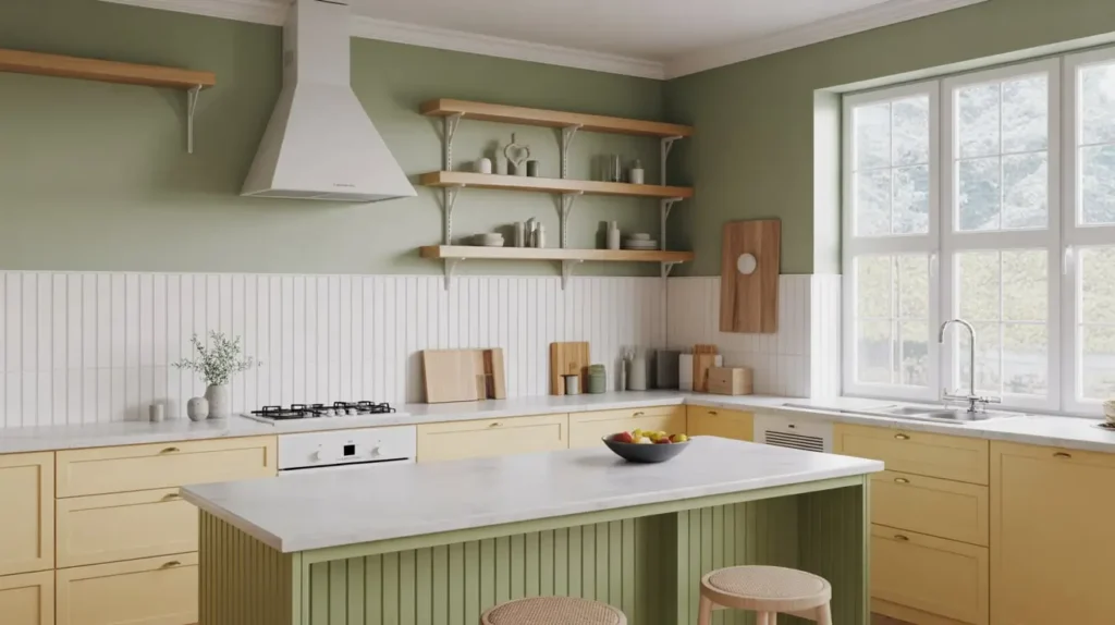
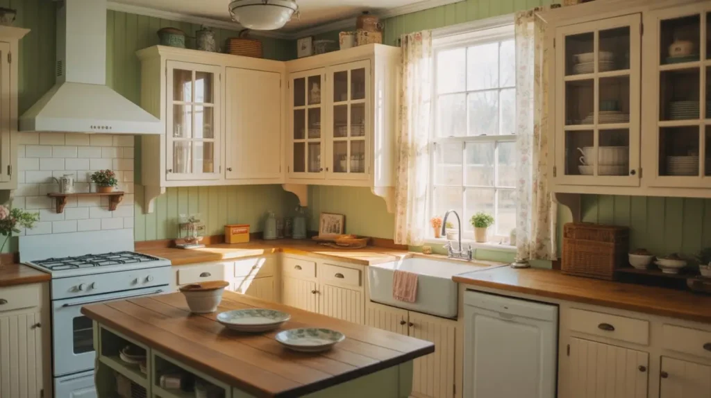
Sage Green Accent Wall Kitchen
Ever notice how sage green just makes everything feel instantly calmer? I discovered this when I painted one wall in my kitchen sage green, and suddenly the whole vibe changed.
Sage green works brilliantly as an accent wall because it’s sophisticated without being overwhelming. You get that trendy green kitchen look without committing every single wall to color. Smart move, right?
Here’s what makes sage green such a winner:
- Pairs beautifully with white cabinets – The contrast is chef’s kiss
- Works in both modern and traditional kitchens – Seriously versatile
- Doesn’t clash with stainless steel appliances – Unlike some greens that can look weird next to metal
- Creates a natural, earthy atmosphere – Perfect for that biophilic design trend everyone’s obsessing over
The best part? Sage green doesn’t scream for attention. It whispers elegance. I usually recommend painting the wall behind your stove or the one you see when you walk in. That way, you maximize impact without overwhelming your space.
Pro tip: If you’re worried about commitment, test your sage green on a large poster board first. Move it around the kitchen at different times of day. Natural light will change how it looks, and trust me, you want to see it in morning light AND evening ambiance before you crack open that paint can.
Olive Green Shiplap Walls
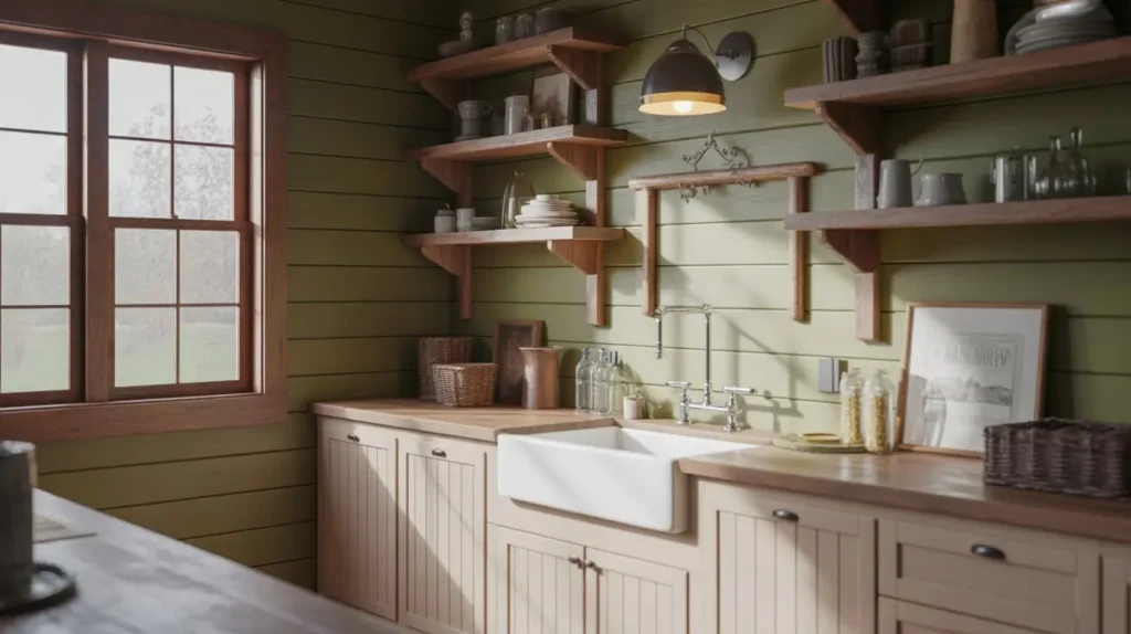
Okay, shiplap might sound like farmhouse overload, but hear me out. When you paint shiplap olive green instead of the predictable white, you get texture AND color in one genius move.
I’ve seen olive green shiplap transform boring kitchens into magazine-worthy spaces. The horizontal lines add visual interest while the olive tone brings warmth that plain white just can’t deliver.
Why olive green shiplap works:
- Adds architectural interest – Those grooves catch light and create subtle shadows
- Hides imperfections better than flat walls – FYI, this saved my life when dealing with my old house’s wonky walls 🙂
- Gives you that sought-after texture – Way more interesting than boring flat paint
- Feels both rustic and refined – Depends on how you style it
The trick with olive green shiplap is choosing the right shade. Too dark, and your kitchen feels like a cave. Too light, and you might as well have gone with sage. I learned this the hard way—my first attempt looked like baby food. Not cute.
Look for olive greens with subtle gray undertones. They photograph well, look expensive, and won’t make you feel like you’re cooking in a military tent. Pair it with brass hardware and warm wood tones, and you’ve got yourself a kitchen that feels collected and intentional.
Mint Green Modern Minimalist Kitchen
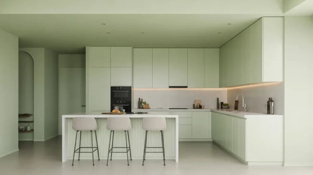
Want to know a secret? Mint green is having a major comeback, and I’m totally here for it.
Forget what you remember from your grandma’s retro kitchen. Modern mint green is fresh, clean, and seriously stylish when you do it right. I’m talking crisp, cool mint that makes your kitchen feel like a breath of fresh air.
In a minimalist kitchen, mint green walls create the perfect backdrop for:
- Sleek white or light wood cabinets – The contrast is perfection
- Simple black accents – Think matte black faucets and handles
- Concrete or white marble countertops – Keeps things feeling modern and clean
- Minimal decor – Let the wall color be your statement piece
The key to pulling off mint in a modern space? Keep everything else super simple. This isn’t the time to go crazy with patterns or competing colors. Let the mint shine as your single pop of personality.
I’ve noticed mint green has this magical ability to make small kitchens feel bigger and brighter. Something about that cool, airy tone tricks your eye into thinking there’s more space. Science? Magic? Who knows—but it works.
One word of caution: mint can lean blue or yellow depending on your lighting. Test samples next to your cabinets and countertops. You want fresh mint, not toothpaste or baby blanket vibes.
Forest Green Textured Paint Walls
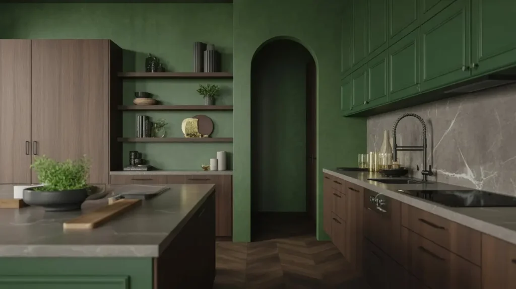
Now we’re getting bold. Forest green textured paint is for people who want their kitchen to make a STATEMENT.
I’ll be honest—when I first considered forest green, I was terrified. It’s dark, it’s intense, and it’s definitely not playing it safe. But after I committed? Best decision ever.
Forest green textured walls bring serious drama:
- Creates instant depth and richness – Your kitchen goes from basic to boutique hotel vibes
- The texture catches light beautifully – Changes throughout the day, which keeps things interesting
- Feels incredibly luxurious – Like you hired an expensive designer (even if you DIY’d it)
- Works surprisingly well in small spaces – Controversial opinion, but dark colors can actually make small rooms feel more intimate and designed
Here’s the thing about textured paint—you’ve got options. Venetian plaster, suede finish, sand texture, or even DIY techniques with sponges and rags. Each creates a different vibe.
I went with a subtle suede finish because it adds dimension without looking like I’m trying too hard. The forest green already does heavy lifting in the drama department, so the texture just enhances it rather than competing.
Word to the wise: forest green LOVES good lighting. If your kitchen lacks natural light, you’ll need to beef up your artificial lighting situation. Under-cabinet lights, pendant lights, maybe even some LED strips. Otherwise, you risk creating a dungeon instead of a jewel box.
Also Read: 15 Fresh Green Backsplash Kitchen Ideas for Stylish Spaces
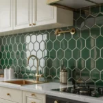
Emerald Green Gloss Finish Kitchen
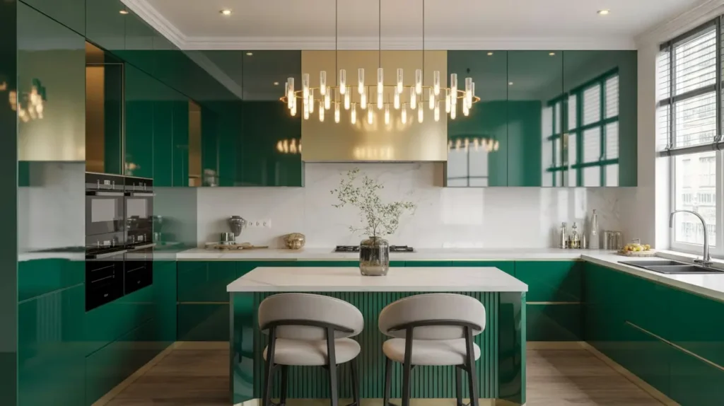
Emerald green with a gloss finish? Yeah, we’re going full glamour here.
This look isn’t for the faint of heart, but if you want a kitchen that absolutely sparkles with personality, emerald gloss is your answer. I’ve seen this in person, and the way light bounces off those shiny green walls is borderline hypnotic.
Why emerald gloss is incredibly chic:
- Reflects light like nobody’s business – Makes even dim kitchens feel brighter
- Photographically stunning – Your Instagram game will level up instantly
- Wipes clean easily – Kitchen grease? Splattered sauce? Just wipe it off that glossy surface
- Gives serious Art Deco vibes – Especially when paired with gold or brass accents
The emerald shade sits right in that sweet spot between grass green and teal. It’s jewel-toned, sophisticated, and undeniably luxe. Add the gloss finish, and you’ve basically turned your kitchen walls into gorgeous green mirrors.
But let’s talk real for a second—gloss shows EVERYTHING. Every imperfection, every ding, every slightly uneven spot on your walls. If your walls aren’t in great shape, you’ll either need to do some serious prep work or reconsider the gloss finish.
IMO, emerald gloss works best as an accent wall or in kitchens with really solid wall conditions. Pair it with white cabinets, marble countertops, and gold hardware for that high-end look that makes people ask, “Wait, did you hire a designer?”
Two-Tone Green and White Walls
Can’t decide between green and white? Why choose when you can have both?
Two-tone walls give you the best of everything—the freshness of white up top and the personality of green below. This approach feels classic, intentional, and surprisingly versatile.
I love two-tone green and white walls because:
- Creates visual interest without overwhelming – Perfect for commitment-phobes
- Makes ceilings appear higher – The white top draws the eye upward
- Protects high-traffic areas – Green on the bottom hides scuffs and marks better than white
- Offers endless green shade possibilities – From soft sage to bold emerald
The traditional split is about one-third green on the bottom, two-thirds white on top, with a chair rail or picture rail molding separating them. But rules are meant to be broken, right? I’ve seen 50/50 splits that look incredible in kitchens with high ceilings.
The trick is choosing a green that complements your cabinets and countertops. If you’ve got white cabinets, you can go bolder with your green choice. Dark cabinets? Maybe stick with lighter, softer greens to keep things balanced.
Here’s a styling tip: add white subway tile or beadboard to that bottom green section for even more texture and traditional charm. Suddenly you’ve got a kitchen that looks like it belongs in a historic home, even if you built it last year.
Soft Pistachio Kitchen Walls
Pistachio green is what happens when mint and sage have a baby—and it’s absolutely adorable.
This soft, creamy green brings warmth without being too yellow, and coolness without being too blue. It’s basically the Goldilocks of green paint colors, and I’m obsessed.
Soft pistachio walls work magic in kitchens:
- Incredibly flattering to skin tones – You’ll actually look good in your kitchen selfies
- Pairs beautifully with natural materials – Wood, rattan, linen all look gorgeous against pistachio
- Feels vintage without being dated – That retro charm with modern sensibility
- Warm enough for north-facing rooms – Unlike cooler greens that can feel icy in low light
I painted my breakfast nook in pistachio, and it instantly became everyone’s favorite spot in the house. There’s something about this color that makes spaces feel cozy and inviting. People actually WANT to hang out in there.
Pistachio plays especially well with cream-colored cabinets, butcher block countertops, and open shelving. It’s got that European kitchen vibe—you know, the kind you see in French farmhouses and Italian villas.
If you’re going for a softer, more romantic kitchen aesthetic, pistachio is your color. Add some vintage brass fixtures, maybe a farmhouse sink, and some fresh flowers, and boom—you’ve got a kitchen straight out of a lifestyle blog.
Dark Moss Green Cozy Kitchen
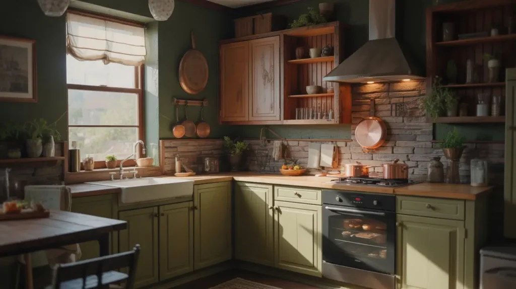
Dark moss green is for people who want their kitchen to feel like a warm hug.
This deep, earthy green leans brown, making it incredibly grounding and cozy. Unlike brighter greens that energize, moss green calms and comforts. Perfect for kitchens that double as gathering spaces.
Why dark moss green creates such cozy vibes:
- Feels incredibly organic and natural – Like bringing the forest indoors
- Creates an intimate, cocoon-like atmosphere – Especially great for eat-in kitchens
- Sophisticated alternative to beige or gray – All the warmth, way more personality
- Looks expensive without trying hard – Something about this color just screams quality
I’ll admit—dark moss requires confidence. You’re essentially wrapping your kitchen in a deep, moody color. But if you commit fully and style it right, the payoff is huge.
The secret to making dark moss work? Layer in warm lighting, natural textures, and plenty of wood tones. Think wooden cutting boards, woven baskets, linen tea towels. These elements prevent the space from feeling too heavy.
Dark moss also pairs incredibly well with matte black fixtures, open shelving displaying cream-colored dishes, and vintage-inspired appliances. You’re going for that lived-in, collected-over-time look that feels authentic and welcoming.
Fair warning: this isn’t the color for tiny, windowless kitchens. You need decent natural light or really good artificial lighting to pull this off. Otherwise, cozy quickly becomes cave-like, and nobody wants that.
Green Marble Effect Wall Design
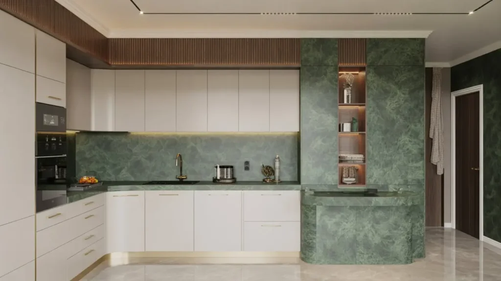
Okay, so maybe your budget doesn’t include actual marble. Who cares? Green marble effect paint techniques give you the luxe look without the luxe price tag.
I recently saw a kitchen with a green marble effect accent wall, and I literally stopped mid-conversation to stare at it. The depth, the movement, the sheer drama of it—absolute perfection.
Green marble effect walls offer:
- The wow factor of real marble – Without the cost or maintenance headaches
- Unique artistry – No two marble effects look exactly alike
- Incredible visual interest – Your eyes never get bored looking at it
- Versatility in shade – From soft seafoam marble to dramatic forest green veining
You can achieve this look several ways. Hire a faux finish artist (pricey but guaranteed gorgeous), try DIY marble painting techniques (cheaper but riskier), or use high-quality marble-effect wallpaper (middle ground option).
I’ve experimented with the DIY route, and here’s the truth—it takes practice. Your first attempt probably won’t look like a Carrara marble kitchen. But if you’re patient and watch a few tutorials, you can create something genuinely impressive.
The key is choosing green marble tones that complement your overall kitchen palette. White marble with soft green veining works beautifully in light, airy kitchens. Darker green marble with gold veining? That’s your ticket to serious luxury vibes.
Place your marble effect wall behind your stove or sink for maximum impact. These focal point areas deserve something special, and a green marble wall delivers in spades.
Also Read: 15 Gorgeous Light Green Kitchen Ideas to Inspire You
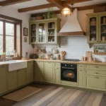
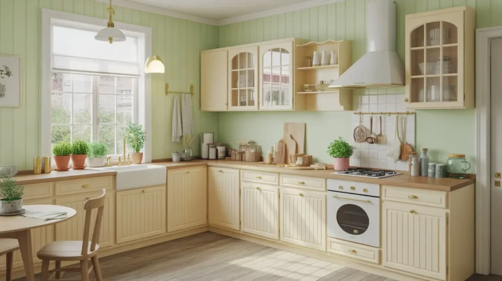
Pastel Green Farmhouse Kitchen
Pastel green in a farmhouse kitchen is basically a match made in heaven.
This soft, muted green brings all the charm of country living without feeling too precious or overly rustic. I’m talking about that perfect shade that looks like it’s been there for decades, even if you just painted it last weekend.
Pastel green farmhouse walls excel because:
- Complements white shiplap and beadboard – Classic farmhouse combo
- Works beautifully with open shelving – Shows off your white dishware perfectly
- Pairs with vintage and antique pieces – Feels collected rather than decorated
- Creates a light, airy atmosphere – Farmhouse should feel open and welcoming
The pastel green farmhouse look is all about balancing color with texture. Think painted cabinets, exposed brick, wooden beams, and maybe some vintage signs or prints. Everything works together to create that effortlessly charming aesthetic.
I love styling pastel green walls with copper pots, ceramic pitchers filled with fresh greenery, and vintage glassware. These elements enhance the farmhouse vibe without making it feel like a country store exploded in your kitchen.
One thing I’ve learned: pastel green can go sweet really fast if you’re not careful. Balance it with some grounding elements—black window frames, dark wood countertops, or wrought iron hardware. This keeps your farmhouse kitchen from tipping into overly cutesy territory.
Bold Teal-Green Feature Wall
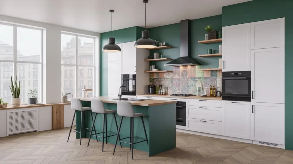
Teal-green walks that gorgeous line between blue and green, and honestly, I can’t get enough of it.
This color brings energy, personality, and a modern edge that other greens sometimes lack. It’s bold without being aggressive, colorful without being childish. Basically, teal-green is the cool kid of the green family.
Why teal-green feature walls rock:
- Incredibly photogenic – This color loves cameras
- Pairs with both warm and cool tones – Surprisingly versatile
- Creates a contemporary, fresh vibe – Feels current and on-trend
- Works in various design styles – From bohemian to modern to coastal
I’ve used teal-green as a feature wall in a kitchen with white cabinets and natural wood accents, and the combination was chef’s kiss. The teal brought just enough color to make things interesting without overwhelming the space.
The beauty of doing teal-green as a feature wall rather than the whole kitchen? You get that punch of personality with built-in restraint. It’s attention-grabbing but not exhausting.
Style your teal-green feature wall with plants (obviously), brass or copper accents, and maybe some geometric patterns in your textiles or backsplash. You’re going for that curated, design-forward look that says you know what you’re doing.
Pro tip: teal-green looks absolutely stunning when natural light hits it. If you’ve got a wall with good sun exposure, that’s your feature wall candidate. Watch it change throughout the day—sometimes more teal, sometimes more green, always gorgeous.
Lime Green Contemporary Kitchen

Alright, lime green is definitely the most daring choice on this list, but hear me out before you click away.
Modern lime green is NOT the neon nightmare you’re imagining. I’m talking about a sophisticated, slightly muted lime that brings energy and optimism without burning your retinas. Think fresh cut limes, not highlighter markers.
Lime green contemporary kitchens work when you:
- Keep everything else minimal and clean – White cabinets, simple hardware, uncluttered counters
- Use it strategically – Maybe one accent wall or lower cabinets only
- Pair with neutral tones – Gray, white, or black keep lime from going overboard
- Embrace the playful vibe – This color isn’t serious, and that’s okay
I’ll be real with you—lime green isn’t for everyone. If you prefer safe, timeless choices, skip this one. But if you want a kitchen that makes people smile, that energizes you while you cook, that absolutely refuses to be boring? Lime green might be your soulmate.
The contemporary styling is crucial here. Sleek cabinets, modern appliances, clean lines—these elements balance the playfulness of lime green with sophistication. Without them, you risk looking like a 90s throwback instead of a trendy contemporary space.
I’ve seen lime green work beautifully with white quartz countertops, stainless steel appliances, and black accents. The combination feels young, fresh, and unapologetically fun. Not every kitchen needs to be elegant and serious, right?
Dusty Green Scandinavian Style Walls
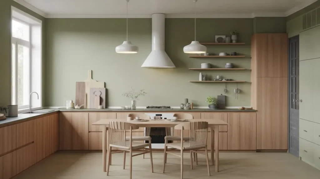
Dusty green is basically what Scandinavian design dreams are made of.
This muted, slightly gray-green embodies everything we love about Scandi style—calm, natural, understated, and effortlessly beautiful. It’s the color equivalent of a deep breath and a warm cup of coffee on a quiet morning.
Dusty green Scandinavian walls shine because they:
- Create a serene, peaceful atmosphere – Perfect for the intentional living Scandi style promotes
- Pair beautifully with light woods – Oak, birch, pine all look amazing against dusty green
- Work with minimal decor – The color provides interest, so you don’t need clutter
- Feel timeless rather than trendy – This won’t look dated in five years
The Scandinavian approach is all about intentionality and simplicity. Your dusty green walls become the backdrop for carefully chosen functional items that also happen to be beautiful. Think wooden utensils in a ceramic jar, a simple pendant light, maybe a single plant.
I adore dusty green because it’s sophisticated without being pretentious. It doesn’t scream for attention—it just quietly makes your entire kitchen feel more pulled together and thoughtful.
Keep your accessories minimal and mostly neutral. White dishes, natural textiles, maybe a touch of black or dark gray. The dusty green provides all the color you need. Anything more risks cluttering the clean aesthetic Scandinavian style is famous for.
This is also a fantastic choice if you’re dealing with a kitchen that gets limited natural light. Dusty green doesn’t rely on bright light to look good—it actually looks quite lovely in softer, diffused light conditions.
Seafoam Green Cottage Kitchen
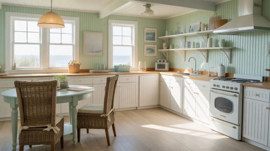
Seafoam green instantly transports you to a beachy cottage, even if you’re landlocked in the middle of nowhere.
This soft blue-green brings all the coastal vibes—relaxed, breezy, and refreshingly unpretentious. I painted a rental kitchen seafoam green once, and even though it was a tiny galley kitchen, it suddenly felt like a seaside escape.
Seafoam green cottage kitchens feel magical because:
- Evokes ocean and sky – Brings the outdoors in
- Pairs perfectly with white – The classic coastal color combo
- Feels light and airy – Great for smaller kitchens
- Works with vintage and cottage-style elements – Think glass-front cabinets and apron sinks
The cottage aesthetic is all about comfortable, lived-in charm. Your seafoam walls set the stage for collected treasures, vintage finds, and handmade elements. Nothing should feel too precious or matchy-matchy.
I love styling seafoam green with white beadboard, open shelving displaying mismatched dishes, and natural fiber rugs. Maybe add some beach glass in jars, coral specimens, or vintage nautical prints. You’re creating a space that feels like a beach house, even if the actual beach is hundreds of miles away.
One thing to watch: seafoam can lean too blue or too green depending on your lighting. Test samples thoroughly. You want that perfect balance that reads as both ocean and fresh garden—not swimming pool or mint toothpaste.
Seafoam green also photographs beautifully, which is a bonus if you’re the type who likes sharing your space on social media. (No judgment—I totally am too.)
Deep Hunter Green Luxe Kitchen Walls

We’re ending with the most dramatic option: deep hunter green for pure luxury.
This isn’t playing around. Hunter green is rich, sophisticated, and unapologetically bold. It’s the color of British country estates, expensive libraries, and kitchens that cost more than my car.
Deep hunter green walls deliver luxury through:
- Incredible depth and richness – Looks expensive, period
- Stunning contrast with gold and brass – These metals were MADE for hunter green
- Timeless elegance – This color has been classy for centuries
- Creates a moody, intimate atmosphere – Perfect for evening entertaining
I’ve walked into hunter green kitchens that literally took my breath away. There’s something about this deep, saturated green that feels both traditional and completely current. It’s a color with serious presence.
The key to pulling off hunter green? Commit fully and style it right. Half-hearted hunter green looks like a mistake. But when you go all in with the right lighting, fixtures, and accessories, it looks like a million bucks.
Pair hunter green walls with:
- White or cream cabinets for contrast
- Brass or gold hardware and fixtures
- Marble countertops (white, black, or even green-veined)
- Crystal or glass pendant lights
- High-quality window treatments
Lighting becomes absolutely crucial with hunter green. You need layers—under-cabinet lighting, pendant lights, maybe even a chandelier if your space allows. These light sources interact with the deep green to create constantly shifting shadows and highlights. It’s basically living in a jewel box.
Hunter green works especially well in larger kitchens with good natural light. Small, dark kitchens might struggle with this much intensity. Know your space’s limitations before you commit to such a dramatic color.
Final Thoughts
So there you have it—15 green kitchen wall ideas ranging from soft and subtle to bold and dramatic. The beautiful thing about green? There’s literally a shade for every style, every personality, and every kitchen size.
I’ve tried several of these approaches in my own spaces, and the one thing I’ve learned is this: trust your gut. If a color makes your heart happy when you see it, that’s probably the right choice. Don’t let anyone tell you your kitchen should be boring beige just because it’s “safe.”
Green brings life, personality, and freshness to kitchens in a way that neutral colors simply can’t match. Whether you’re team sage, team emerald, or team hunter, you’re making a choice that’ll make your kitchen feel uniquely yours.
Start with samples, take your time, and remember—it’s just paint. If you hate it, you can always repaint. (Though honestly, once you go green, you probably won’t want to go back.)