

Hi there! Pull up a chair (preferably a comfy one, not those metal bar stools that look cool but hurt your back) and let’s talk kitchens. Specifically, let’s talk about the color that saves us from the blinding sterility of pure white while keeping everything bright and airy: Off-White.
Listen, I get it. You walk into the paint store thinking, “I’ll just grab some white paint for the cabinets.” Three hours later, you’re staring at forty-seven varying shades of “cloud,” “cotton,” and “alabaster,” questioning your eyesight and your sanity. We have all been there. Choosing the right white feels surprisingly high-stakes.
Here is the truth: Stark white cabinets often feel too clinical. Unless you want your kitchen to resemble a hospital operating room, you need warmth. That is where off-white comes in to save the day. It brings that clean, crisp vibe we all crave but adds a layer of depth and coziness that pure white simply lacks. It hides the inevitable tomato sauce splatter a little better, too.
I’ve spent years obsessing over kitchen design (and making plenty of mistakes in my own home), so I’m here to walk you through this. We are going to look at 15 stunning off-white kitchen cabinet ideas that scream modern charm. No fluff, no “in today’s world” speeches—just real, actionable ideas to make your kitchen look expensive and inviting.
Let’s get into it.
1. Modern Farmhouse Off-White Cabinet Makeover
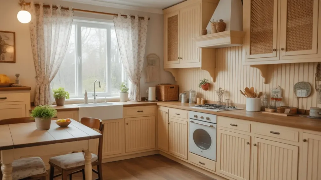
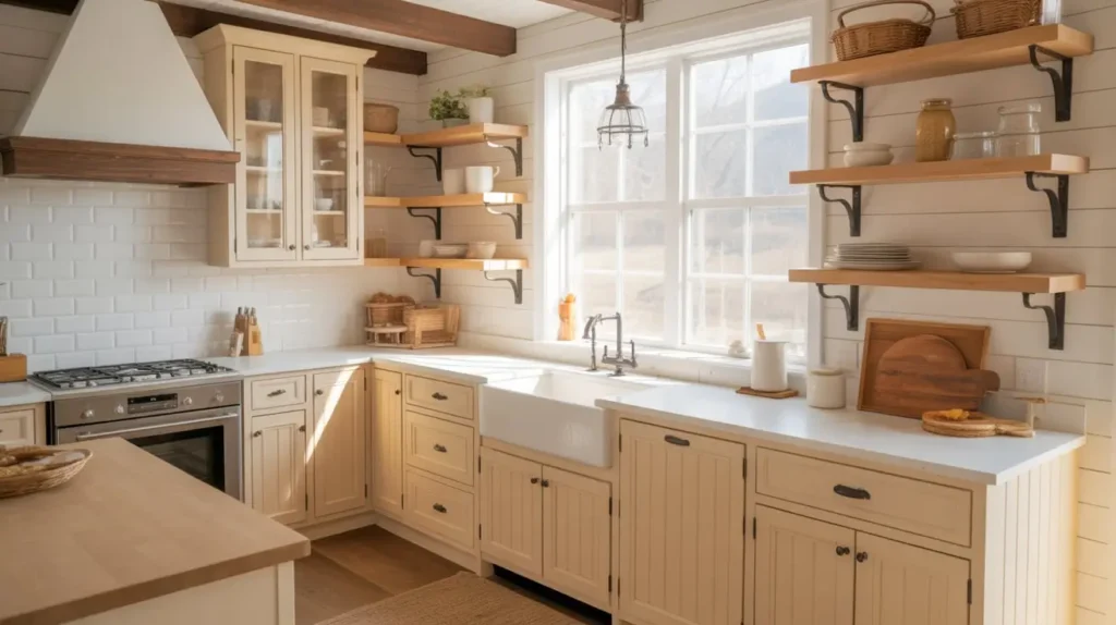
The farmhouse trend refuses to die, and honestly, I see why. It feels like a hug. But we need to move away from the kitschy rooster statues and “Live, Laugh, Love” signs. We want a sophisticated, modern farmhouse aesthetic. Off-white cabinets serve as the perfect foundation for this look because they bridge the gap between old-school rustic and new-school clean.
The Shaker Door Dominance
You cannot achieve this look without Shaker-style doors. They define the genre. I recommend pairing a creamy off-white Shaker cabinet with a matte black cup pull. The contrast prevents the room from looking like a dairy farm and gives it a modern edge.
Why this works:
- Versatility: The clean lines of Shaker cabinets suit almost any decor changes you make later.
- Warmth: Off-white softens the harsh angles often found in modern appliances.
If you plan to tackle this yourself, prep work is key. I once skipped sanding before painting my Shaker doors. Do not do that. You will regret it every time you peel a strip of paint off with your fingernail. Trust me, sanding is boring, but peeling paint is heartbreaking.
Adding the “Farm” Elements
Incorporate a large apron-front sink. White fireclay looks classic, but if you want to mix it up, try a hammered copper sink against those off-white cabinets. The warmth of the copper pulls out the yellow or beige undertones in the paint, making the whole room glow. Does a copper sink require maintenance? Yes. Is it worth it for the compliments you’ll get? Absolutely.
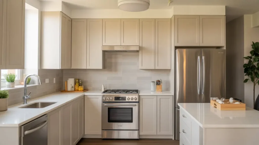
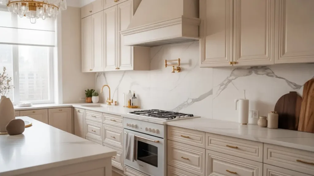
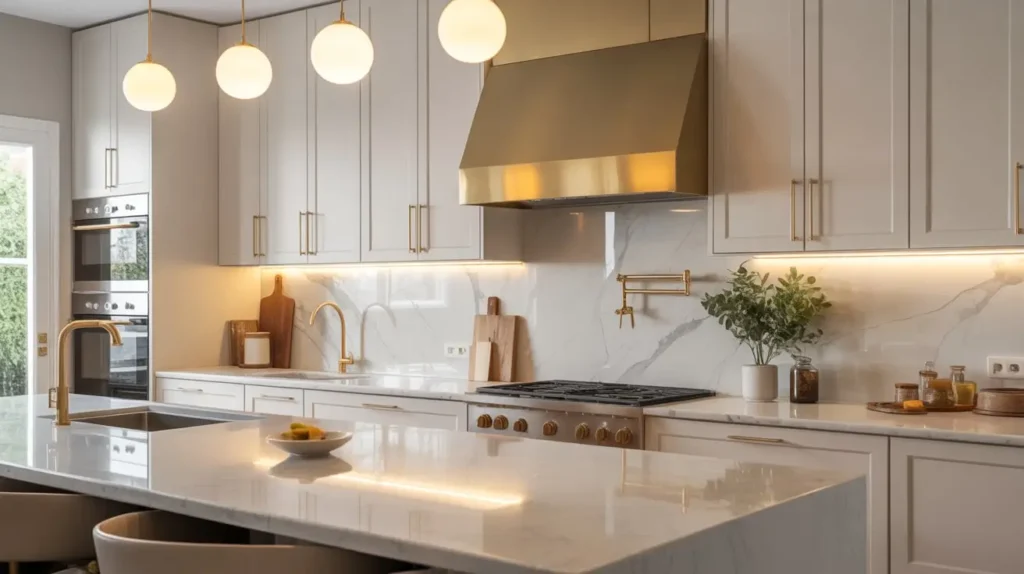
2. Off-White Cabinets with Gold Hardware

If you want your kitchen to look expensive on a shoestring budget, gold hardware is your secret weapon. I remember when gold fixtures felt dated, like something from a 1980s bathroom. Now? They scream luxury. The trick lies in the finish you choose.
Choosing the Right Gold
Stay away from shiny, yellow chrome-gold. It looks cheap. Instead, opt for brushed brass or champagne bronze. These finishes possess a muted quality that looks incredible against off-white.
Hardware options to consider:
- Knurled texture knobs: These add a tactile, industrial feel that feels amazing to touch.
- Oversized pulls: Long, sleek handles make standard cabinets look custom-made.
- Exposed hinges: For a vintage vibe, let the metal show.
The Color Interplay
Off-white usually carries warm undertones—think vanilla or pale taupe. Gold hardware enhances these warm notes. If you use silver or nickel, you risk cooling the room down too much. Gold keeps the energy up. I swapped my old brushed nickel knobs for unlacquered brass recently, and the difference was night and day. It felt like putting jewelry on a plain outfit. Plus, unlacquered brass develops a patina over time that looks authentically aged.
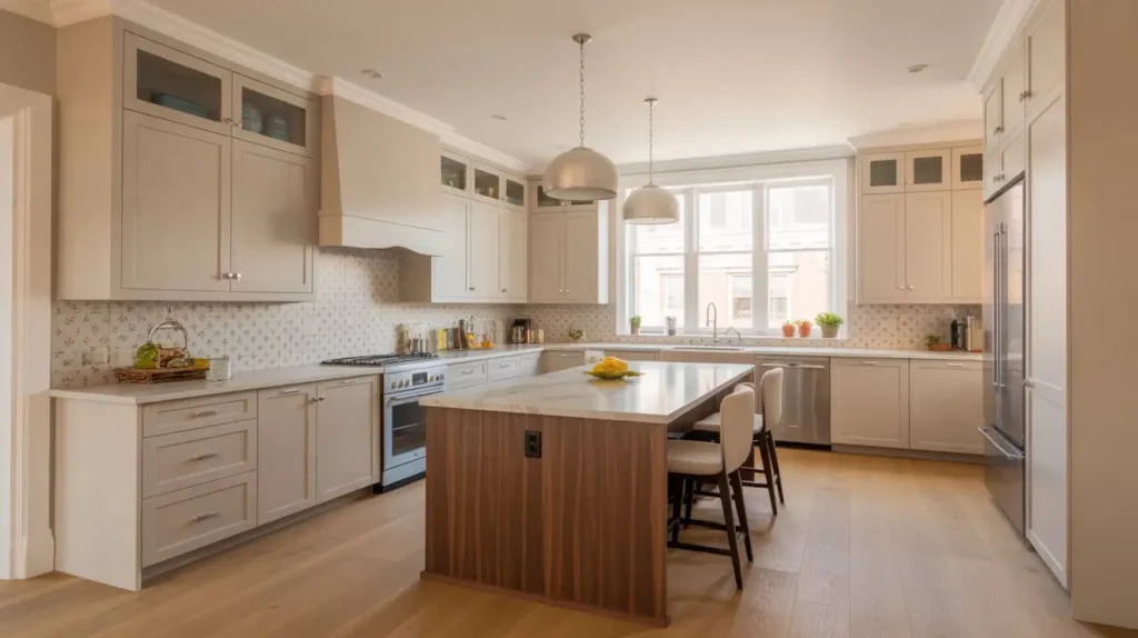
3. Creamy Off-White Cabinets in a Small Kitchen
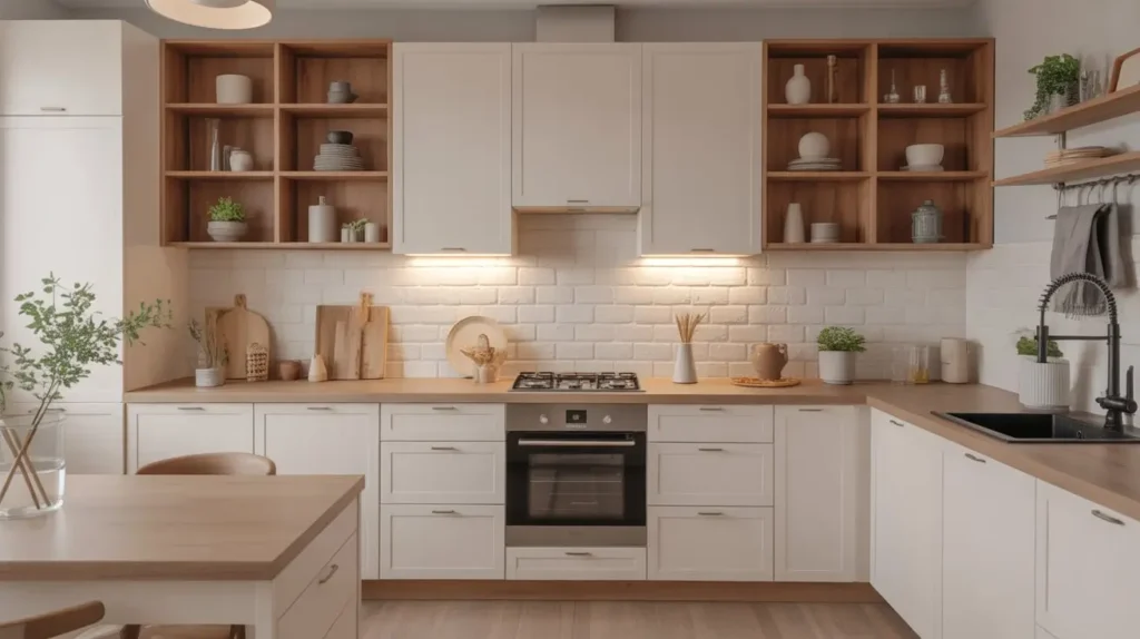
Small kitchens frustrate the best of us. You turn around and bump into the fridge; you open the oven and block the doorway. While you might not be able to knock down walls without a structural engineer, you can definitely trick the eye. Creamy off-white cabinets reflect light, making a cramped space feel airy and open.
Maximizing Light Reflection
Stark white can feel jarring in a small space, creating sharp shadows. A creamy off-white, however, diffuses light softly. If your kitchen lacks windows, this is crucial.
How to enhance the effect:
- Glossy finishes: Consider a semi-gloss or high-gloss paint. It acts like a mirror, bouncing light around the room.
- Under-cabinet lighting: Install LED strips to illuminate the counters. It banishes dark corners and highlights the creamy cabinet color.
Vertical Thinking
Take your off-white cabinets all the way to the ceiling. I cannot stress this enough. If you leave that awkward one-foot gap above the cabinets, you just create a dust trap. By extending the cabinetry up, you draw the eye upward, making the ceilings feel higher. IMO, it’s the single best design choice for small spaces. You can store the Christmas platters you use once a year up there.
4. Off-White Cabinets with Marble Countertops
This combination is the bread and butter of high-end kitchen design. It’s classic, it’s elegant, and yes, it’s high maintenance. But beauty often requires sacrifice, right?
Balancing the Whites
Mixing whites intimidates people. You might worry that an off-white cabinet will make your white marble look grey, or vice versa. The key is in the veining. Look for marble (or quartz that looks like marble) with warm gold or brown veining, like Calacatta Gold.
Stone selection tips:
- Carrara Marble: Usually has cool grey veining. This can work if your off-white leans towards grey (greige).
- Calacatta Marble: Features bolder, warmer veining. This pairs perfectly with creamy or yellow-based off-whites.
- Quartz Alternatives: If you drink red wine or cook with turmeric, skip real marble. Get a quartz look-alike. It saves you from a heart attack every time a spill happens.
Texture Play
Since the color palette is monochromatic, you need texture to keep it interesting. Use a honed finish on the marble rather than polished. The matte look feels softer and more organic against the painted cabinets. I love the way honed marble feels under my hand—it’s velvety rather than cold and slick.
5. Two-Tone Kitchen with Off-White Uppers

Commitment issues? Join the club. If you can’t decide between a moody dark kitchen and a light, airy one, do both. The two-tone trend is a lifesaver for adding color without overwhelming the space.
The Grounding Effect
Paint your lower cabinets a darker color and keep the uppers off-white. This “grounds” the room. Dark colors feel heavier, so visually, it makes sense for them to be at the bottom.
Winning color combinations:
- Navy Blue & Off-White: Nautical, classic, and crisp. It feels very “Hamptons.”
- Forest Green & Off-White: Earthy and very trendy right now. It brings the outdoors in.
- Charcoal & Off-White: High contrast and dramatic without being as harsh as pure black.
Visual Weight
By keeping the upper cabinets off-white, you prevent the kitchen from feeling like a cave. I visited a friend recently who painted her entire small kitchen navy blue. It looked cool, but I felt like I was cooking in a submarine. :/ Keeping the top light maintains that sense of openness we talked about earlier. It also allows your backsplash to shine as a bridge between the two colors.
6. Greige Off-White Cabinets for a Cozy Look
Meet “Greige.” It’s the love child of grey and beige, and it is arguably the most versatile color in existence. If yellow-based creams remind you too much of 1990s almond appliances, greige is your answer.
Why Greige Works
It brings the modern sleekness of grey but adds the warmth of beige. It changes with the light. In the morning sun, it might look warm and inviting. Under artificial light at dinner, it looks sophisticated and moody. It’s a chameleon.
Styling Greige:
- Wood tones: Greige looks phenomenal next to walnut or white oak. The wood pulls out the brown notes in the paint.
- Metals: It plays nice with both silver and gold hardware.
- Wall color: You can paint the walls a crisp white, and the greige cabinets will pop just enough to show they aren’t white, but not so much that they look dark.
I painted my bathroom vanity a greige color last year (Sherwin Williams Agreeable Gray, FYI). It was the only decision my partner and I agreed on immediately. It’s a crowd-pleaser for a reason.
7. Off-White Cabinets with Black Accents

If you prefer a kitchen with a bit of attitude, you need contrast. Pairing off-white cabinets with bold black accents creates a striking, graphic look that feels incredibly modern. This is the “tuxedo” look of kitchens—sharp, tailored, and timeless.
Where to Use Black
You don’t want to overdo it. The goal is punctuation, not a paragraph. You want the eye to bounce around the room, landing on these dark moments.
Strategic black placements:
- Window frames: Painting window sashes black frames the view like art.
- Faucets: A matte black faucet against an off-white backdrop looks sculptural.
- Light fixtures: Black metal pendants or sconces anchor the space.
The Countertop Choice
To really drive this home, consider honed black granite or soapstone countertops. Soapstone is a personal favorite of mine. It scratches, yes, but it develops a patina that tells a story. Plus, oiling it down is weirdly satisfying. The dark counters create a horizon line that breaks up the vertical off-white cabinetry, making the ceilings feel even higher.
8. Coastal Style Off-White Kitchen Design
You do not need to live in Malibu to enjoy a coastal kitchen. In fact, if you live in a rainy city, you might need this sunny vibe even more. Coastal design is not about seashells and anchor motifs anymore. It’s about light, air, and natural tones.
The Palette
Start with your off-white cabinets. They mimic the color of sand or foam. Then, layer in blues and greens. I’m not talking about bright turquoise. Think dusty blue, seafoam green, or navy.
Design elements to include:
- Glass front cabinets: Display your blue or white dishware. It breaks up the solid wood fronts and adds depth.
- Rattan textures: Use woven pendant lights or bar stools. The natural texture warms up the off-white paint instantly.
- Backsplash: A pale blue or green glass tile looks like water and reflects light beautifully.
Flooring Matters
Light wood floors are essential here. A bleached oak or a light maple complements the off-white cabinets perfectly. Dark floors can look too heavy for a breezy coastal vibe. When I renovated a beach rental, we went with wide-plank white oak, and it instantly made the off-white IKEA cabinets look custom and high-end.
9. Off-White Cabinets with Subway Tile Backsplash
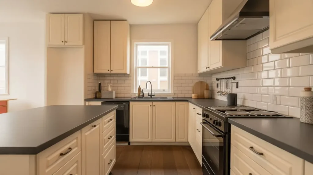
Is subway tile boring? Some say yes. I say it’s classic. There is a reason you see it in bistros and subways (obviously) over a century old. It never really looks bad. Pairing it with off-white cabinets is a safe bet, but that doesn’t mean it has to be dull.
Mixing the Whites
Here is the trick: Don’t match the tile perfectly to the cabinets. If your cabinets are a creamy off-white, use a bright white tile. The subtle difference creates layers and prevents the “whiteout” effect.
Grout is your friend:
- White grout: Creates a seamless, textured wall. Good for minimalists.
- Grey grout: Highlights the pattern of the bricks. Good for industrial or farmhouse looks.
- Dark grout: Creates high contrast. Very retro.
Layout Patterns
You can also change the pattern. You don’t have to stack them like bricks.
- Herringbone: Looks upscale and moves the eye around the room.
- Vertical stack: Makes ceilings look higher and feels very modern.
I helped a friend install a vertical stack subway tile backsplash last month. It took us twice as long as a standard running bond, but it completely transformed her standard builder-grade kitchen.
10. Chalk-Painted Off-White Cabinet DIY
Let’s talk budget. Maybe you don’t have $20,000 for new custom cabinetry. Chalk paint is a DIYer’s best friend. It requires minimal prep work (you can skip the heavy sanding, hallelujah!), and it gives a beautiful, matte, vintage finish.
The Process
Chalk paint adheres to almost anything. However, don’t get lazy. You still need to clean the grease off your cabinets first. If you paint over grease, that paint will slide right off in a month.
Steps for success:
- Clean: Scrub with a degreaser (TSP is the gold standard).
- Paint: Apply 2-3 thin coats of an off-white chalk paint (Annie Sloan is the classic choice).
- Wax: This is crucial. Chalk paint is porous. You must seal it with clear wax.
The Antique Look
If you want that “lived-in” charm, use a dark wax in the corners and crevices after the clear wax. It settles into the details and makes the cabinets look aged and expensive. I did this on a dresser once, and people constantly ask where I bought the antique piece. Just go easy on the dark wax—a little goes a long way, or it just looks dirty.
11. Off-White Cabinets with Wood Flooring
Cold feet are the worst. Visually cold kitchens are a close second. Wood flooring brings instant heat to a kitchen filled with off-white cabinetry. The contrast between the painted wood and the stained wood is naturally pleasing to the eye.
Choosing the Tone
The tone of the floor dictates the vibe of the kitchen.
- Dark Walnut: Creates a formal, elegant look. It pops against the off-white. Warning: dark floors show every speck of dust and dog hair.
- Medium Oak: The timeless choice. It hides dirt well and balances the cabinets.
- Blonde/Ash: Scandi and modern. Keeps the whole room very light and ethereal.
Material Options
If real hardwood scares you (water damage is a real threat in kitchens), look at Luxury Vinyl Plank (LVP). The technology has improved insanely fast. I installed LVP in my laundry room, and you have to touch it to realize it isn’t wood. It pairs beautifully with off-white cabinets and handles spills like a champ. Plus, it’s softer underfoot when you’re chopping veggies for an hour.
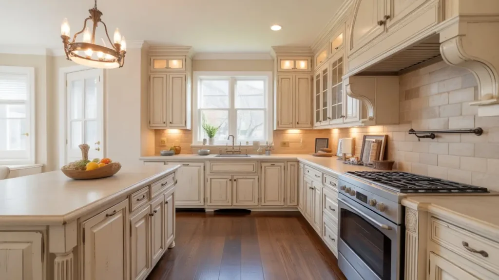
12. Warm Off-White Cabinets in a Rustic Kitchen
Rustic doesn’t have to mean “log cabin.” Modern rustic is about raw textures and natural materials. Off-white cabinets act as a clean backdrop that lets those rougher elements shine without making the room feel like a dungeon.
Embrace Imperfection
In a rustic kitchen, you don’t want the cabinets to look too perfect. Distressing is an option here. Sanding down the edges slightly to reveal the wood underneath creates a sense of history.
Key elements to add:
- Reclaimed wood beams: Install these on the ceiling. The rough wood against the smooth off-white paint creates amazing tension.
- Stone walls: If you have exposed brick or stone, leave it! Off-white cabinets complement red brick or grey stone beautifully.
Countertop Pairings
Skip the polished granite. Go for butcher block countertops. They are affordable, warm, and easy to sand down if you stain them. Just remember to oil them regularly. I neglected mine for six months once, and it started to crack. Lesson learned. FYI, mineral oil is cheap and works wonders.
13. Off-White Cabinets with Open Shelving

This trend divides people. Some love the airy look; others hate the dust. IMO, open shelving is fantastic if you use it strategically. Replacing a few upper cabinets with wood shelves breaks up the wall of off-white and makes the kitchen feel larger.
Styling the Shelves
The shelves themselves should contrast the wall. If the wall is off-white (matching the cabinets), use natural wood shelves.
What to put on them:
- Matching dishware: This is critical. A stack of mismatched plastic cups kills the vibe. Stick to white ceramics, glass jars, or copper mugs.
- Plants: Pothos or succulents add a pop of life (and oxygen!).
- Art: Lean a small framed print against the wall.
The “Floating” Look
Use hidden brackets for a floating shelf look. It’s cleaner and more modern. Just make sure you hit the studs. I watched a friend load up a shelf that wasn’t anchored properly, and the crash of breaking dishes still haunts me. If you have heavy stoneware, use visible iron brackets for support—they look great with the rustic vibe anyway.
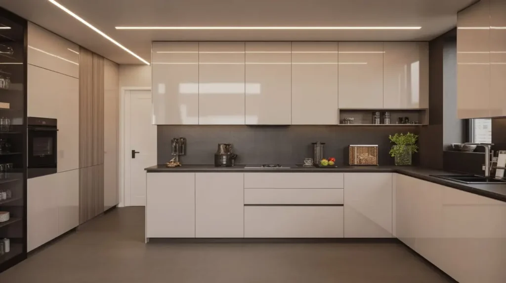
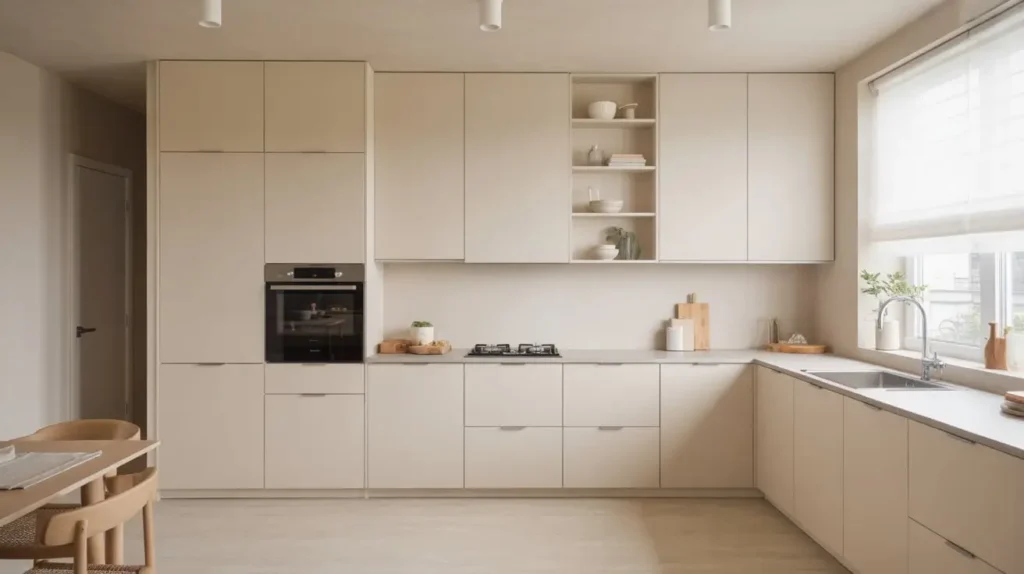
14. Minimalist Off-White Kitchen Aesthetic
Minimalism isn’t just about having less stuff; it’s about clean lines and tranquility. Flat-panel (slab) off-white cabinets are the hallmark of this style. They lack the ornamentation of Shaker or raised-panel doors, creating a smooth, uninterrupted visual flow.
The “No-Hardware” Look
To keep it truly minimalist, skip the knobs and pulls entirely. Use push-to-open latches or integrated finger pulls (channels routed into the top of the door). This removes visual clutter.
Why this works:
- Cleaning: No crevices for dust to hide in. You just wipe the flat surface.
- Calmness: Your eye doesn’t snag on anything. It just glides across the room.
Palette Discipline
Stick to a strict color palette. Off-white cabinets, concrete or solid white quartz countertops, and maybe one accent material like pale wood. Avoid patterns. The beauty lies in the simplicity and the quality of the materials. It’s very Zen.
15. Off-White Cabinets with Brass Pendant Lights
We touched on hardware earlier, but lighting deserves its own moment. Lighting is the jewelry of the kitchen. Brass pendant lights hanging over an island or sink provide a focal point that off-white cabinets desperately need.
Scale and Proportion
Don’t be afraid to go big. A tiny light fixture looks sad and apologetic. Oversized brass pendants make a statement.
Styles to watch:
- Globe lights: Mid-century modern and very popular. They diffuse light evenly.
- Cone pendants: Industrial and sleek. They focus light downward onto the work surface.
- Lantern style: Classic and traditional. Great for the farmhouse look.
The Warmth Factor
Brass reflects light warmly. When the bulb is on, the brass glows, casting a golden hue onto your off-white cabinets. It enhances those creamy undertones we love. Just ensure you hang them at the right height—usually 30 to 36 inches above the countertop. I once hung mine too low and head-butted the shade while chopping veggies. Don’t be like me. Measure twice.
Conclusion
Choosing off-white cabinets isn’t just a safe choice; it is a smart one. You get the brightness of white without the sterility. You get a canvas that lets you change your style—from farmhouse to modern to coastal—without ripping out your cabinetry every five years.
Whether you go for the drama of black accents, the luxury of gold hardware, or the coziness of wood floors, off-white handles it all. It is forgiving, it is flexible, and it is timeless.
So, stop staring at those paint chips until your eyes cross. Pick a creamy shade that makes you smile, grab a brush (or a contractor), and get started. Your kitchen is begging for a makeover, and trust me, you won’t regret the warmth and charm that off-white brings to the table.
Now, go make that kitchen the heart of your home. You’ve got this. 🙂