
You’re sitting at your dining table, sipping your morning coffee or maybe a well-deserved glass of wine. You look up, and you’re staring. At a wall. A big, blank, soul-crushingly boring wall. Does it have a sad, lonely print from a big-box store hanging there? Maybe. Or is it just a vast expanse of beige that whispers, “I’ve given up”?
I’ve been there. My first apartment’s dining “area” (let’s be generous) had a wall so bland it could have been a character in an existential play. It took me a while to realize that this wall wasn’t just a structural necessity; it was a canvas. An opportunity. It’s the backdrop to family dinners, late-night chats, and holiday chaos. It deserves to be more than just… there.
So, if you’re tired of staring into the void during dinner, you’ve come to the right place. We’re going to walk through 15 dining room wall decor ideas that are anything but boring. From super simple to a little more involved, there’s something here for every style, budget, and DIY skill level. Let’s turn that wall from a sad beige rectangle into the star of the show.
1. The Statement Gallery Wall
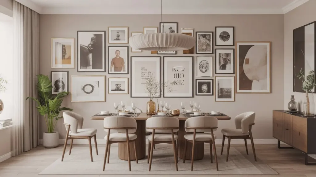
What It Is
A gallery wall is a curated collection of art, photographs, and meaningful objects arranged together on one wall. Think of it as a scrapbook you can hang up. It’s personal, it’s eclectic, and it’s a fantastic way to fill a large space without committing to one giant piece of art.
Why I Love It
Honestly, this is my go-to for a reason. A gallery wall tells a story—your story. It can be a mix of family photos, travel snapshots, prints from your favorite artists, and even quirky finds like a vintage postcard or a child’s drawing. There are no hard-and-fast rules, which is both liberating and, let’s face it, a little terrifying. But the result is a wall that is 100% unique to you.
The best part? It can grow and change over time. Found a new print you love? Swap one out. Have a new family photo? Add it to the collection. It’s a living piece of decor.
How to Pull It Off
Creating a great gallery wall isn’t just about hammering nails randomly. A little planning goes a long way.
- Lay It Out First: Before you even think about touching a hammer, lay all your pieces out on the floor. Arrange and rearrange them until you find a composition you love.
- Create Paper Templates: Trace each frame onto kraft paper or newspaper, cut them out, and tape them to the wall. This lets you visualize the spacing and balance perfectly before making any holes. Seriously, do not skip this step. It has saved me from so much spackle and regret.
- Mix and Match: The most interesting gallery walls have a mix of frame styles, colors, and sizes. Combine thick black frames with thin metallic ones, or throw in a rustic wood frame. The key is to have a unifying element, like a consistent color in all the art or a common mat color.
- Mind the Gap: Keep the spacing between your frames relatively consistent, usually 2-3 inches apart. It helps the whole collection look cohesive rather than cluttered.
2. The Oversized Wall Art Centerpiece

What It Is
This one is for the decisive among us. Instead of a collection of smaller pieces, you choose one single, massive piece of art to be the undisputed focal point of the dining room. It’s bold, it’s dramatic, and it makes a huge impact with minimal effort.
Why I Love It
Simplicity. That’s it. While I adore a good gallery wall, sometimes the thought of curating, framing, and arranging 15 different pieces is exhausting. An oversized art centerpiece is the opposite. You find one piece you’re obsessed with, hang it up, and you’re done. Boom. Instant drama.
This approach works wonders in both large and small dining rooms. In a big space, it can hold its own. In a smaller space, a large piece of art can actually make the room feel bigger by creating a strong, uncluttered focal point. It’s a neat little design trick.
How to Pull It Off
The key here is scale. Go bigger than you think you need to.
- The Two-Thirds Rule: A great rule of thumb is to choose a piece of art that is roughly two-thirds the length of your dining table or sideboard. This ensures it feels substantial and intentional, not like a postage stamp on a giant wall.
- Hang at Eye-Level: The center of the artwork should be at eye-level, which is typically 57-60 inches from the floor. If you’re hanging it above a sideboard, leave about 6-8 inches of space between the top of the furniture and the bottom of the frame.
- Find Your Masterpiece: You don’t have to spend a fortune. Check out sites like Etsy for large-scale digital downloads you can have printed, or look for up-and-coming local artists. Sometimes, a simple, large-scale abstract piece with just a few colors can be more powerful than a busy, complex scene.
3. The Decorative Mirror Feature Wall
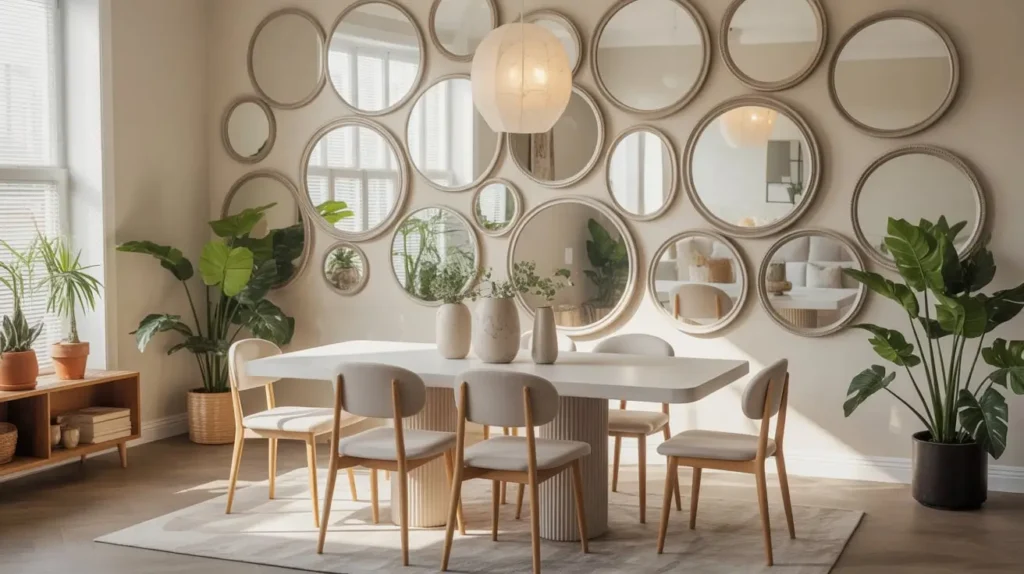
What It Is
This is an old-school designer trick for a reason: it works. A decorative mirror, or a collection of them, can serve as functional art. It bounces light around, makes the room feel larger and brighter, and adds a touch of glamour.
Why I Love It
My dining room doesn’t get a ton of natural light, so a large mirror was a game-changer. It practically doubles the light from the window and the chandelier, making the whole space feel more open and airy. It’s like adding another window, but without the construction crew and the nosy neighbors.
You can go in so many directions with this. A single, enormous, ornately framed mirror can feel very grand and traditional. A collection of mismatched, vintage-style sunburst mirrors can create a fun, bohemian vibe. Or a simple, large, round mirror with a thin metal frame can look incredibly chic and modern.
How to Pull It Off
Mirrors are all about placement and style.
- Reflect Something Pretty: When placing your mirror, think about what it will reflect. Ideally, it should reflect a beautiful view out a window, a stunning light fixture, or another piece of art. Avoid placing it where it will reflect a cluttered corner or a blank wall. That kind of defeats the purpose, right?
- Single vs. Collection: For a single mirror, follow the same scale rules as oversized art—aim for it to be about two-thirds the width of the furniture below it.
- For a collection, treat it like a gallery wall. Lay the mirrors out on the floor first to get the arrangement right. This works especially well with a variety of shapes and sizes.
4. The Floating Shelf Styling Wall

What It Is
Think of floating shelves as a 3D gallery wall. They provide a space to display not just framed art but also plants, ceramics, cookbooks, and other decorative objects. They add depth and personality to a wall in a way that flat art can’t.
Why I Love It
I’m a chronic rearranger. I love changing up my decor with the seasons, and floating shelves are my playground. They offer incredible flexibility. In the fall, I can style them with mini pumpkins and warm-toned ceramics. For the holidays, they’re covered in greenery and twinkle lights. It’s an easy way to refresh the entire look of the room without any major investment.
This idea is also incredibly practical. In a small dining room, floating shelves can double as storage for serving dishes, glassware, or your favorite cookbooks. Form and function—what’s not to love?
How to Pull It Off
The secret to beautiful shelves is styling, not just storage.
- Create Visual Triangles: When arranging objects, try to create visual triangles. Place a tall item (like a vase with branches), a medium item (like a stack of books), and a small item (like a little bowl) together. This grouping creates balance and is pleasing to the eye.
- Vary Height and Texture: Mix tall, skinny objects with short, wide ones. Combine smooth ceramics with a rough-textured plant pot or a sleek metal object. The variety is what makes it interesting.
- Don’t Overcrowd: This is the most important rule. Leave some breathing room. You don’t need to fill every single inch of the shelf. Negative space is your friend; it prevents the shelves from looking like a cluttered mess.
Read Also 15 Beautiful Small Dining Room Decor Ideas to Maximize Space
5. The Textured Wall Panel Accent
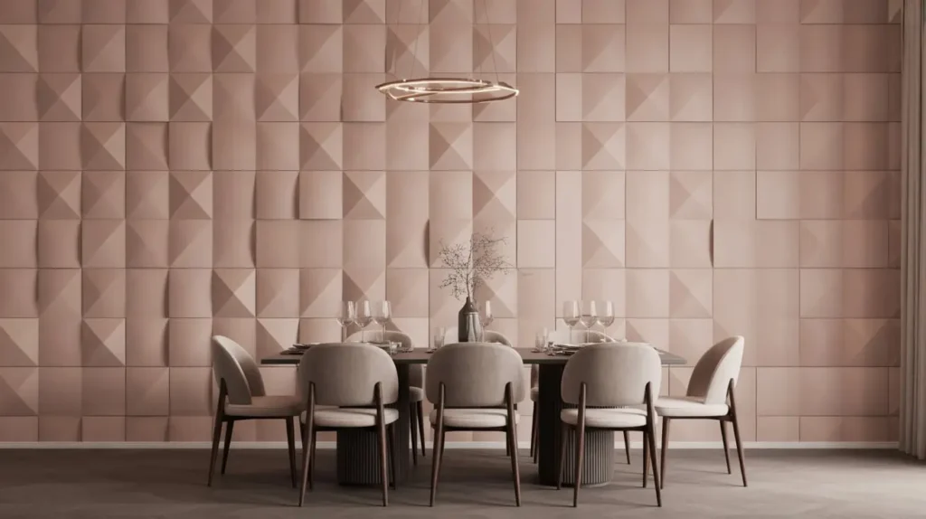
What It Is
Ready to move beyond paint? Textured wall panels are dimensional pieces, often made of materials like MDF, PVC, or even upholstered fabric, that you install on a wall to create a stunning accent. They add depth, shadow, and a sophisticated architectural element to the room.
Why I Love It
This one feels luxe. It’s the kind of feature you see in a high-end hotel or a fancy restaurant and think, “I could never have that.” But you can! There are so many DIY-friendly options now, from geometric 3D panels you can paint any color to peel-and-stick upholstered panels that give you a soft, cozy look.
It’s a fantastic way to add interest to a room that feels a little flat. The way light hits the different angles and textures creates a dynamic effect that changes throughout the day. IMO, it’s a total showstopper.
How to Pull It Off
- Choose Your Material: 3D wall panels are often sold in tiles. You can arrange them in a repeating pattern for a uniform look or mix them up. Upholstered panels offer a softer, more custom feel and can even help with sound absorption—a bonus in a noisy dining room.
- Plan Your Layout: Decide if you want to cover the entire wall or just a section of it, perhaps behind a sideboard. A partial wall can be just as effective and more budget-friendly.
- Paint is Your Friend: Most hard panels come in a paintable white or off-white. You can either paint them the same color as the rest of your walls for a subtle, textural look or go with a bold, contrasting color to make it a true accent wall.
6. The Minimal Frame Grid Display
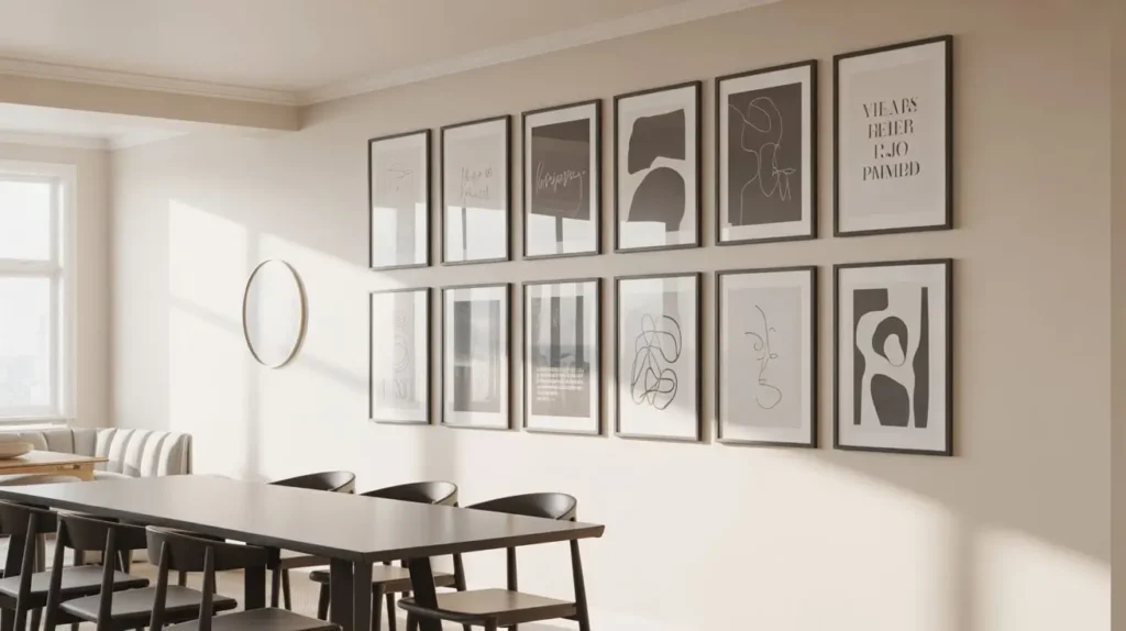
What It Is
If the eclectic, “anything goes” vibe of a classic gallery wall makes you break out in a cold sweat, the minimal frame grid is for you. This is its orderly, type-A cousin. It involves hanging a series of identical frames in a perfect, symmetrical grid.
Why I Love It
The clean lines and perfect symmetry are incredibly calming and sophisticated. It’s a very intentional, polished look that works beautifully in modern, transitional, and minimalist dining rooms. It takes the guesswork out of arranging because the layout is predetermined.
I used this approach in my old office with a grid of nine square black-and-white photos, and the effect was stunning. It looked like a single, large piece of art from a distance but revealed personal details up close. It’s the perfect blend of personal and polished.
How to Pull It Off
Precision is the name of the game here.
- Identical Everything: For this to work, you need identical frames and identical matting. The art or photos inside can be different, but keeping them in the same color family (like all black-and-white or all sepia) enhances the cohesive feel.
- Measure, Measure, Measure: This is not the time to eyeball it. Use a tape measure, a level, and painter’s tape to mark out exactly where each nail will go. The spacing between each frame—both horizontally and vertically—must be precise. Aim for 2-4 inches of separation.
- Start in the Center: Hang the center frame first and work your way out. This helps ensure the entire grid is centered on the wall.
7. The Botanical Wall Decor Arrangement
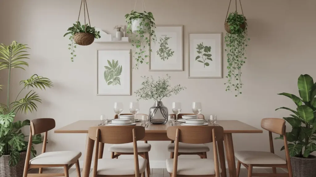
What It Is
Bring the outdoors in! This idea revolves around using plants, dried flowers, and botanical-themed art to create a fresh, living wall. It can be as simple as a few hanging planters or as elaborate as a full-on living wall.
Why I Love It
Plants just make people happy, don’t they? They add life, color, and texture to a space. A botanical wall can make a dining room feel like a serene, peaceful oasis. Plus, if you use real plants, they literally clean the air. It’s decor that does a job.
My personal favorite is a collection of vintage-style botanical prints. You can find gorgeous, high-resolution digital downloads of old scientific illustrations online. Print them out, pop them in some simple wood frames, and you have an instant, sophisticated botanical gallery.
How to Pull It Off
- Mix Real and Faux: Combine living plants in wall-mounted or hanging planters with high-quality faux plants (yes, they exist!) and botanical art.
- Pressed Flower Art: This is a beautiful and personal DIY project. Press flowers from your garden or a special bouquet in a book, then arrange them in a floating glass frame. It’s a delicate and timeless look.
- Consider a Living Wall: For the truly ambitious, a vertical living wall system can be an incredible feature. They require more maintenance (watering, light), but the payoff is a breathtaking piece of living art. There are plenty of modular kits available to make this more approachable.
8. The Wall Sconce Accent Styling

What It Is
Wall sconces are often thought of as just a light source, but they can be major decorative players. This idea involves using a pair (or more) of beautiful sconces to frame another piece of decor, like a mirror, a piece of art, or a console table.
Why I Love It
It’s like adding jewelry to your walls. Sconces add a layer of ambient lighting that is so much warmer and more inviting than harsh overhead lights. The soft glow they cast can completely change the mood of a dining room, making it feel cozier and more intimate.
They also add a wonderful sense of symmetry and purpose to a wall. A piece of art hanging by itself is nice. A piece of art flanked by two elegant sconces? That’s a vignette. It feels considered and complete.
How to Pull It Off
- Hardwired vs. Plug-In: Don’t be scared off by the wiring. If you don’t want to hire an electrician, there are tons of stylish plug-in wall sconces available. Many come with cord covers you can paint to match your wall, making them nearly invisible.
- Choose a Style that Complements: The style of your sconces should complement your room’s overall aesthetic. Brass or bronze sconces can add warmth and a vintage touch, while matte black or chrome feels more modern.
- Placement is Key: Typically, you’ll hang sconces on either side of a central element. Place them at about eye-level (around 60 inches from the floor) and ensure they are spaced evenly from the object they are framing.
9. The Sculptural Wall Art Installation
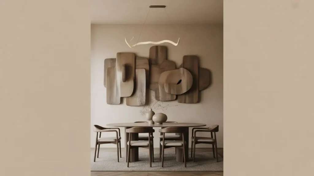
What It Is
Move over, flat art. Sculptural wall decor is all about three-dimensional form. This can be anything from a series of ceramic birds in flight to an abstract metal installation or a collection of woven baskets. It’s art that literally pops off the wall.
Why I Love It
Texture, texture, texture! A dining room often has a lot of hard, flat surfaces—the table, the floor, the walls. Sculptural art breaks that up beautifully. It plays with light and shadow in a way a painting can’t, creating a sense of movement and depth.
I once found a set of gorgeous, handcrafted ceramic discs at a local art fair. I hung them in an organic, flowing pattern on my dining room wall, and they became an instant conversation starter. People can’t help but want to touch them (I have to politely ask them not to :)).
How to Pull It Off
- Go Big or Go Home: With sculptural pieces, scale is important. A tiny, lonely sculpture on a large wall will look lost. It’s often better to group several smaller pieces together to create one large installation.
- Think in 3D: When planning your layout, consider how the pieces will look from different angles, not just straight on.
- DIY Options: You don’t need to commission a sculpture. A collection of round, woven placemats or trivets of different sizes can create a stunning, bohemian-style installation for a fraction of the cost.
Read Also 15 Stunning Dining Room Table Decor Ideas for Elegant Homes
10. The Neutral Canvas Art Wall

What It Is
Sometimes, what a room needs isn’t a pop of color, but a dose of calm. This idea focuses on using large-scale canvas art in a neutral palette—think whites, creams, beiges, grays, and blacks. The focus is on texture, subtle form, and composition rather than bright hues.
Why I Love It
This is the epitome of quiet luxury. It’s sophisticated, timeless, and incredibly versatile. Neutral art doesn’t compete with other elements in the room; it complements them. It can provide a serene, calming backdrop in a minimalist space or offer a moment of visual rest in a more eclectic room.
There’s a trend right now for DIY “plaster art,” where you apply joint compound or plaster to a canvas to create a heavily textured, minimalist piece. It’s a super affordable way to get a high-end look, and it’s a fun, surprisingly therapeutic project.
How to Pull It Off
- Focus on Texture: Since you aren’t using color, texture is the star of the show. Look for pieces with visible brushstrokes, thick impasto techniques, or even mixed media elements like sand or fabric.
- Consider a Diptych or Triptych: A diptych (two panels) or triptych (three panels) can fill a large wall and create a powerful, cohesive statement. Hanging them with a small gap of 1-2 inches in between adds to the architectural feel.
- Frame or No Frame: A simple, gallery-wrapped canvas (where the art extends around the sides) can look very modern and clean. For a more finished look, a thin “floater frame” in a natural wood or black is a perfect choice.
11. The Vintage Plate Display Wall
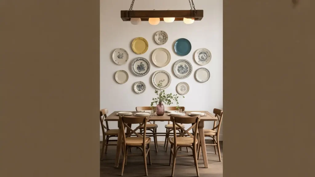
What It Is
No, this isn’t just for your grandma’s house (though Grandma had the right idea). A wall display of decorative or vintage plates is a charming, unique, and often surprisingly affordable way to create a feature wall.
Why I Love It
It’s the thrill of the hunt! Scouring flea markets, thrift stores, and antique shops for beautiful, mismatched plates is half the fun. Each plate has a history, a story. It’s a wonderful way to add character and a touch of nostalgia to your dining room—a room built for gathering and making memories.
You can create so many different looks with this. A collection of classic blue-and-white chinoiserie plates feels timeless and traditional. A mix of colorful, mid-century modern patterns can be fun and retro. Or, a grouping of simple white plates in different shapes and sizes can be surprisingly modern and sculptural.
How to Pull It Off
- Safety First: Use proper plate hangers. These are wire gadgets with springs that grip the plate securely and have a hook for hanging. Do not, I repeat, do not try to use sticky tabs. You will wake up to the sound of shattering porcelain and a broken heart.
- Plan the Arrangement: Just like a gallery wall, lay your plates out on the floor to figure out your composition before hanging. You can create a symmetrical grid, a circular shape, or a more organic, free-flowing arrangement.
- Mix It Up: Don’t feel like you have to stick to just one style. A mix of patterns, colors, and sizes often looks the most dynamic and personal. Just look for a common thread, like a shared color or a similar level of intricacy.
12. The Wood Slat Accent Wall
What It Is
This is a hugely popular trend for a good reason. A wood slat wall involves installing thin vertical strips of wood onto a wall, usually with a small gap in between each slat. It adds incredible warmth, texture, and a modern architectural feel to any space.
Why I Love It
The visual impact is off the charts. It manages to feel both organic and contemporary at the same time. The vertical lines draw the eye upward, making the ceiling feel higher. Plus, it can have acoustic benefits, helping to dampen sound in a room with a lot of echo.
I recently helped a friend install one in his dining room, and it completely transformed the space. He painted the wall behind the slats matte black before installing natural oak slats, and the contrast is just chef’s kiss. It went from a builder-grade box to a custom-designed space in one weekend.
How to Pull It Off
- DIY or Buy a Kit: You can absolutely DIY this with a saw, a nail gun, and some patience. Or, you can buy pre-made panels that make installation much faster and easier.
- Choose Your Wood and Finish: Oak, walnut, and maple are popular choices. You can leave them natural, stain them, or paint them. Painting the slats the same color as the wall creates a very subtle, textural look.
- Behind the Slats: The color of the wall behind the slats makes a big difference. A dark color like black or charcoal will create a dramatic contrast and make the wood pop. A matching color will be more subtle and serene.
13. The Typography Quote Art Wall

What It Is
Words have power. This idea is about using a favorite quote, a meaningful phrase, a family name, or even a single, powerful word as the art itself. This can be a large-scale painted mural, a vinyl decal, or a collection of framed typographic prints.
Why I Love It
It’s the most direct way to inject personality and meaning into a room. Ever walked into a home and a piece of art just made you smile? A well-chosen quote can do that every single day. It can be a reminder, an inspiration, or just a bit of fun.
But a word of caution. We need to be careful to avoid the… let’s say, overdone phrases of the 2010s. If I see another “Live, Laugh, Love” I might just “Leave, Languish, Lament.” The key is to choose something that is genuinely personal to you. Maybe it’s an inside joke, a line from your favorite poem, or the coordinates of where you met your partner.
How to Pull It Off
- Go Custom: Instead of a generic print, consider commissioning a piece on Etsy or from a local calligrapher. You can also design your own using online tools and have it printed.
- Think About Scale and Style: A single, large, bold word in a sans-serif font feels very modern. A flowing script quote painted directly onto the wall can feel more romantic and traditional. A collection of smaller framed prints with different fonts can create a gallery wall effect.
- Consider a Neon Sign: For a super fun, retro-modern vibe, a custom neon or LED sign with a favorite word or phrase can be an amazing statement piece.
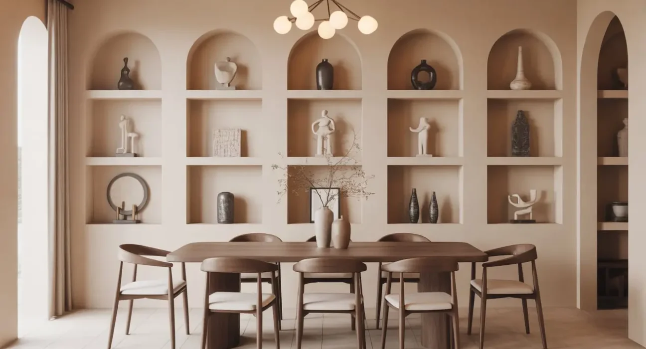
14. The Arched Wall Niche Styling
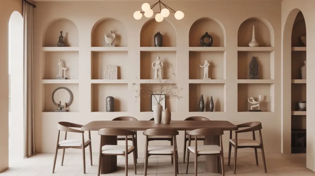
What It Is
Arches are having a major moment. Creating an arched niche in your dining room wall gives you a built-in, designated spot for styling. It’s an architectural feature that adds softness, elegance, and a custom feel.
Why I Love It
An arch instantly elevates a space. It breaks up the monotony of straight lines and right angles that dominate most rooms. It feels both classic (hello, Roman aqueducts) and totally on-trend. Painting the inside of the arch a contrasting color turns it into a piece of art in its own right.
It’s the perfect home for a special vase, a small sculpture, or a few cherished books. It frames these objects beautifully, drawing attention to them in a way that a simple shelf can’t.
How to Pull It Off
- The Real Deal: A true recessed niche involves cutting into your drywall and framing out the arch. This is a more involved project but gives the most authentic result. If you’re handy, it’s a manageable weekend project.
- The Faux-Niche Hack: Don’t want to cut into your walls? No problem. You can create the illusion of a niche with paint. Simply paint a tall, arched shape on your wall in a contrasting color. It gives you a similar effect with zero construction.
- Style It Simply: The beauty of the niche is its shape. Don’t overcrowd it. A single, beautiful object or a very small, curated grouping is all you need.
15. The Mixed Material Wall Decor Wall
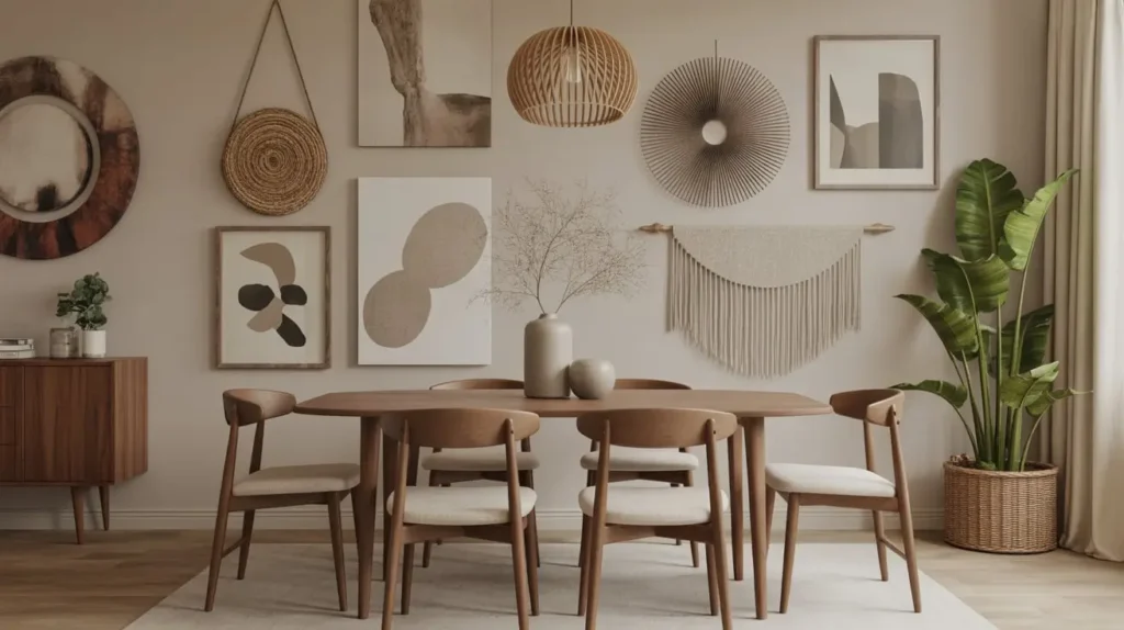
What It Is
This is for the brave, the bold, the maximalist at heart. Why choose one idea when you can combine several? This approach involves layering different materials and decor types to create a rich, deeply personal, and texturally diverse wall.
Why I Love It
It’s the ultimate expression of personal style. It throws the rulebook out the window and says, “My home, my rules.” A mixed-material wall might feature a painted arch, with a small mirror and a couple of sculptural objects hung inside it, flanked by two sconces. Or it could be a gallery wall that incorporates not just frames but also a woven hanging, a small shelf, and a ceramic plate.
This approach creates a wall with so much to look at. It’s a feast for the eyes, and it tells a complex, interesting story about the people who live there.
How to Pull It Off
- Find a Common Thread: To prevent it from looking like a chaotic jumble, you need a unifying element. This could be a strict color palette (e.g., everything is in shades of black, white, and ochre) or a common theme (e.g., a coastal vibe with driftwood, blue-toned art, and woven elements).
- Balance is Everything: Pay attention to visual weight. If you have a large, heavy mirror on one side, you’ll need something with similar visual weight on the other—perhaps a tight grouping of several smaller frames.
- Start with a Base Layer: It can be helpful to start with a base, like a painted feature or an accent wall treatment (like wood slats). Then, layer your other decor elements on top of that.
Your Wall, Your Story
So there you have it. Fifteen ideas to rescue your dining room wall from the clutches of boredom. Your dining room is more than just a place to eat. It’s a place for connection. The wall behind your table is the backdrop for all of that life. It deserves to reflect you.
Don’t be afraid to experiment. Try laying things out on the floor. Use painter’s tape. Most importantly, choose something that makes you happy every time you look at it. So, what are you waiting for? Pick an idea, any idea, and make a move. That blank wall has been waiting long enough.
Happy decorating