
Alright, let’s have a real chat. You’re staring at your living room, and it’s… fine. It’s perfectly okay. But you and I both know that “fine” is the enemy of “fabulous.” You want a change, something that packs a punch without requiring you to sell a kidney for a full-scale renovation. You’ve landed on curtains, and specifically, blue curtains. Smart move.
I’ve been there, scrolling endlessly, holding up paint swatches until my arm hurts, and having minor existential crises in the home decor aisle. Blue isn’t just blue, is it? It’s a whole universe of moods, from calming and serene to bold and downright dramatic. Choosing the wrong one can take your room from chic to… well, a little bit sad.
But don’t you worry. I’ve made the mistakes so you don’t have to. We’re going to walk through 15 incredible blue curtain ideas that are perfect for a modern home. This isn’t going to be some stuffy design lecture. Think of this as me, your decor-obsessed friend, giving you the inside scoop over coffee. Let’s get this sorted.
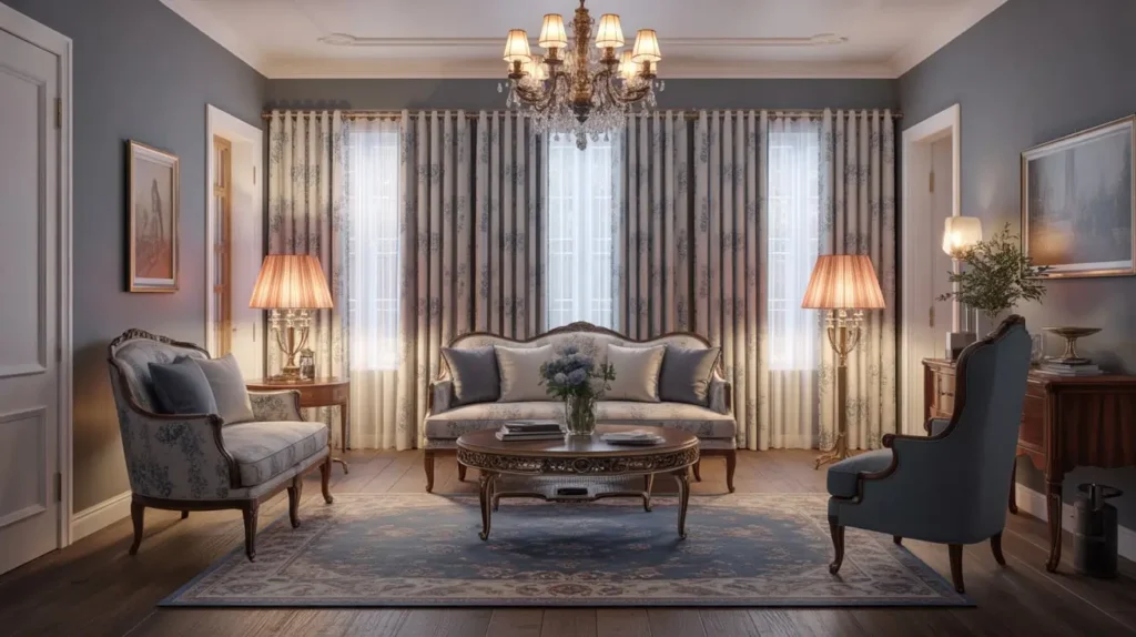
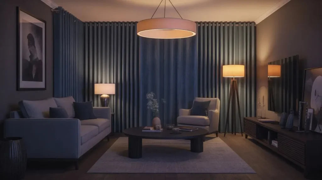
1. Navy Velvet Elegance
Let’s start with a classic, shall we? Navy velvet is the little black dress of the curtain world. It’s sophisticated, timeless, and brings a level of drama that few other fabrics can match. When you hang navy velvet curtains, you’re not just dressing a window; you’re making a statement.
Why It Works in a Modern Home
Modern design often plays with contrast, and this is where navy velvet shines. Imagine these rich, heavy curtains against a crisp, white wall. The deep blue absorbs light, creating a cozy, intimate feeling, while the velvet texture adds a layer of touchable luxury. It’s a perfect way to add warmth and depth to a room that might feel a bit too sterile or minimalist.
Plus, velvet has this incredible way of looking expensive, even when it’s not. It’s a design hack I use all the time to elevate a space on a budget. Because who doesn’t love looking bougie without the price tag?
How to Style It Like a Pro
Getting this look right is all about balance. Since the curtains are so heavy and dark, you need to lighten things up elsewhere.
- Hardware: Go for brushed brass or gold rods. The warmth of the metal against the cool navy is chef’s kiss. A chunky, substantial rod works best to support the weight and match the drama.
- Wall Color: Stick with light and airy. Think creamy whites, very light grays, or even a soft beige. This contrast is what makes the navy pop.
- Furniture: Pair it with furniture that has clean lines. A sleek leather sofa in a cognac or caramel color looks phenomenal. You can also bring in light wood tones or metallic accents in your coffee tables and side tables to keep the room from feeling weighed down.
My Two Cents
A word of caution: navy velvet can be a bit of a diva. It will show every speck of dust and pet hair, so be prepared for a relationship with your lint roller. Also, in a small room with little natural light, it can feel a bit like you’re living in a cave. If that’s your vibe, great! If not, make sure you have plenty of lamps and light-colored decor to balance it out.
2. Sky Blue Sheer Softness
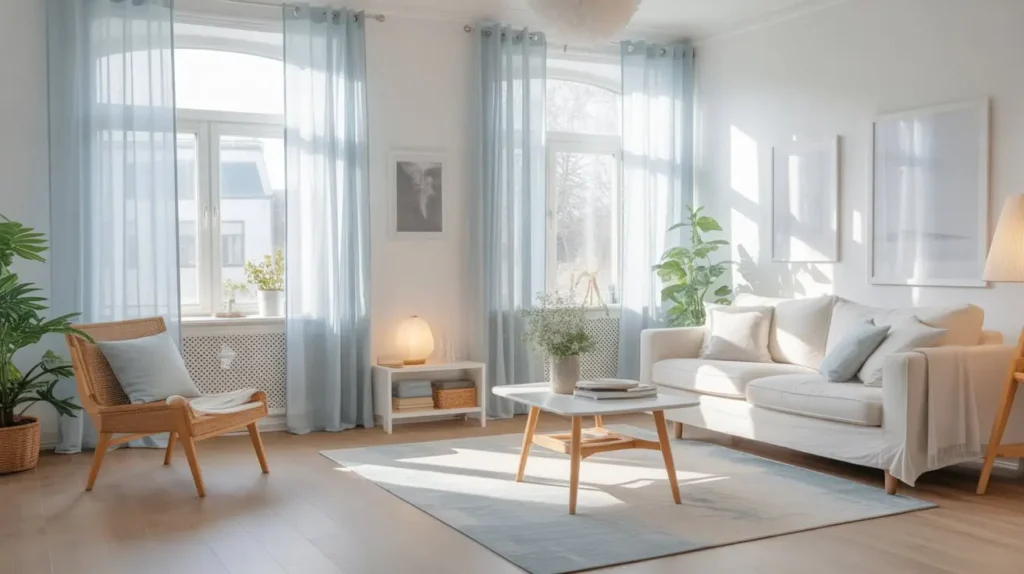
Okay, moving from the drama queen to the dreamy ingenue. Sky blue sheers are the complete opposite of navy velvet. They are light, airy, and all about creating a soft, ethereal glow in your living room. They don’t block light; they filter it, bathing your room in a gentle, calming blue haze.
Why It Works in a Modern Home
Modern spaces can sometimes feel a bit hard-edged with all their clean lines and minimalist furniture. Sheer curtains, especially in a gentle sky blue, introduce a much-needed element of softness and movement. They billow beautifully with a slight breeze from an open window, adding a dynamic, living quality to the room.
They’re also fantastic for maintaining a connection to the outdoors. You get privacy during the day (people can’t really see in) while still being able to see out and enjoy the natural light. It’s the best of both worlds, IMO.
How to Style It Like a Pro
Styling sheers is all about embracing the lightness. You don’t want to weigh them down with heavy-handed decor.
- Hardware: A thin, minimalist rod in white, silver, or a light brushed nickel is perfect. You want the hardware to almost disappear, letting the fabric be the star.
- Layering: For more versatility, layer them! Place the sheer curtains on a double rod with a heavier blackout curtain behind them. This gives you the airy feel during the day and complete privacy and light control at night.
- Overall Vibe: This look is a natural fit for rooms with a Scandinavian or coastal feel. Think light wood floors, plush white or gray sofas, and decor made from natural materials like wicker and light-toned ceramics.
My Two Cents
Let’s be brutally honest here. Sheer curtains offer basically zero privacy at night when you have the lights on inside. If your living room window faces a busy street or your neighbor’s dining room, this might not be the standalone solution for you unless you enjoy putting on a show for the neighborhood. The layering trick I mentioned above is your best friend here.
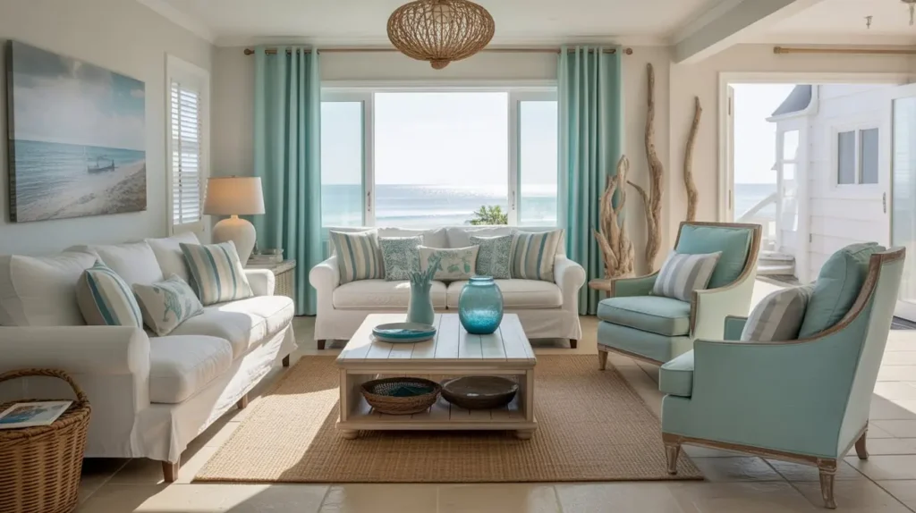
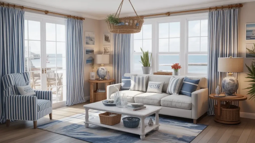
3. Coastal Blue Linen Breeze
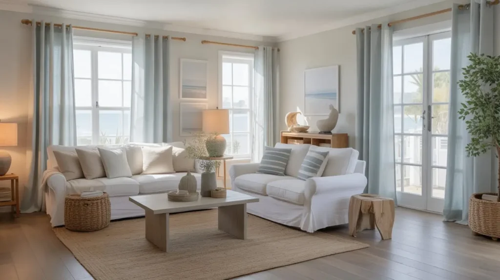
If you want your living room to feel like a permanent vacation, coastal blue linen curtains are your ticket. This isn’t a deep, stormy ocean blue, but rather the color of the sea on a clear, sunny day—a bit muted, with hints of gray or green. The linen fabric is key here; its natural, slightly slubby texture screams relaxed, effortless style.
Why It Works in a Modern Home
Texture, texture, texture! Modern design loves incorporating natural textures to prevent a space from feeling flat. Linen provides just that. It’s a breathable, organic material that brings a touch of rustic, earthy charm to a contemporary setting.
This specific shade of blue is also incredibly versatile. It acts as a serene, calming backdrop that doesn’t scream for attention, allowing other design elements in your room to shine. It’s the strong, silent type of curtain.
How to Style It Like a Pro
The goal is to create a room that feels like a relaxing seaside retreat, even if you live in a landlocked city.
- Hardware: Think natural. A rod in a driftwood finish, matte black, or even a simple white works well. Avoid anything too shiny or ornate.
- Color Palette: Build on the coastal theme with sandy beiges, crisp whites, and soft grays. You can add pops of coral or a deeper navy in your throw pillows for a bit of contrast.
- Furniture & Decor: Light-colored slipcovered sofas, rattan chairs, jute rugs, and art depicting seascapes or abstract water scenes will complete the look. It’s all about feeling casual and comfortable.
My Two Cents
Two words: wrinkles happen. Linen is notorious for wrinkling, and if you’re the type of person who needs everything to be perfectly crisp and ironed, these curtains will drive you insane. My advice? Embrace the wrinkles. They are part of the charm and contribute to that relaxed, “I just threw this amazing room together” look. Fighting them is a losing battle.
4. Royal Blue Modern Panels
Feeling bold? Royal blue is not for the faint of heart. It’s a vibrant, saturated, and energetic color that commands attention. Using it in the form of sleek, modern panels can turn your windows into a stunning focal point. This is the color you choose when you want to inject some serious personality into your space.
Why It Works in a Modern Home
Modernism is often associated with bold color blocking. Think of a Mondrian painting. Royal blue panels against a neutral wall create a powerful, graphic statement. They add a jolt of energy that can bring an otherwise plain room to life.
By choosing a simple panel style—like a grommet top or a back tab—you keep the silhouette clean and contemporary. The focus remains on the power of the color, not on fussy pleats or frills.
How to Style It Like a Pro
When you go this bold with your curtains, you need to be strategic with the rest of the room.
- Hardware: A sleek chrome or matte black rod complements the modern aesthetic perfectly. The coolness of the metal provides a nice contrast to the vibrant blue.
- Balance with Neutrals: Let the curtains be the star. Keep the majority of your room in neutral shades like white, charcoal gray, and black.
- Accent Colors: Pull that royal blue into the room in small doses to create a cohesive look. A few throw pillows, a piece of art, or a vase in the same shade will tie everything together without overwhelming the space. Yellow or a bright orange can be a daring, high-contrast accent color if you’re feeling extra brave.
My Two Cents
This is a commitment. Royal blue is a very specific, very loud color. Before you buy, get a fabric swatch. Live with it for a few days. Tape it to the wall next to your window. Does it make you happy and energized? Or does it give you a headache? It’s better to know before you invest in 10 feet of it.
Read Also 15 Gorgeous Farmhouse Coffee Table Decor Ideas for Your Living Room
5. Teal Boho Patterned Curtains
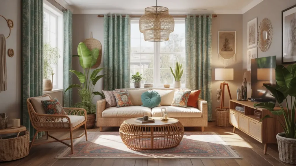
Ready to unleash your inner free spirit? Teal is a fantastic, chameleon-like color, sitting perfectly between blue and green. When you combine it with a bohemian pattern—like a paisley, mandala, or ikat print—you get curtains that are bursting with personality and eclectic charm.
Why It Works in a Modern Home
Modern Bohemian (or “Boho”) is a huge trend that merges the clean lines of modern design with the free-spirited, layered look of bohemian style. These curtains are a perfect embodiment of that fusion. The rich teal color provides a sophisticated base, while the pattern adds a layer of visual interest and a well-traveled, artistic feel.
They prevent a modern room from feeling too rigid or formulaic. They’re a little bit wild, and that’s exactly why they work.
How to Style It Like a Pro
Styling a boho look is all about layering textures, patterns, and personal treasures.
- Hardware: A dark wood or antiqued brass rod adds warmth and complements the eclectic vibe.
- Mix, Don’t Match: Don’t be afraid to mix other patterns! Pair the curtains with a geometric rug or floral throw pillows. The key is to keep them in a similar color family to avoid visual chaos.
- Accessorize: This is where you can go crazy. Layer rugs, pile on the pillows, and fill the room with plants, macrame wall hangings, and souvenirs from your travels (or from the local flea market, no one’s judging).
My Two Cents
With a patterned curtain this bold, it can easily overwhelm a small room. It’s best used in a space with high ceilings and plenty of natural light. And be honest with yourself: are you a maximalist at heart? If the idea of mixing patterns and textures makes you feel anxious, this might not be the look for you. It’s a style that requires a certain amount of organized chaos.
6. Powder Blue Minimalist Drapes
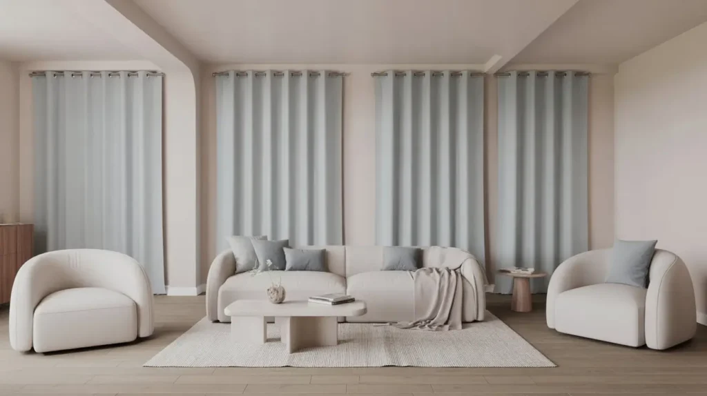
If your design mantra is “less is more,” then I’d like to introduce you to powder blue. This is a soft, muted, and incredibly calming shade. In a simple, unadorned drape, it adds a hint of color and softness to a minimalist space without disrupting the clean, uncluttered aesthetic.
Why It Works in a Modern Home
Minimalism isn’t about having no color; it’s about using color intentionally. Powder blue is the perfect minimalist accent. It’s subtle enough not to demand attention but present enough to add a layer of warmth and serenity that an all-white or all-gray room can sometimes lack.
The effect is incredibly chic and understated. It’s the color equivalent of a quiet, confident whisper.
How to Style It Like a Pro
The key to a minimalist look is editing. Every piece should have a purpose.
- Hardware: Choose a rod that is as unobtrusive as possible. A slim, ceiling-mounted track or a simple, thin white rod will blend in seamlessly.
- Fabric and Style: Opt for a high-quality, plain fabric like a cotton-linen blend or a simple matte polyester. A hidden tab or ripplefold style will give you that clean, uniform wave look that is synonymous with modern minimalism.
- The Room: This look is at home in a space with light wood furniture, clean-lined sofas in shades of gray or white, and a distinct lack of clutter. Let the space itself breathe.
My Two Cents
The danger with minimalism is that it can sometimes tip over into “boring” or “cold.” The softness of the powder blue helps prevent this, but make sure you incorporate some texture in the room—a fluffy rug, a nubby knit throw, or some warm wood tones—to keep it feeling inviting.
7. Indigo Luxury Floor-to-Ceiling
Let’s talk about maximum impact. Indigo is a deep, rich, and soulful blue with a history as old as time. When you take this gorgeous color and use it in floor-to-ceiling curtains, you create a sense of grandeur and soaring height that is simply breathtaking.
Why It Works in a Modern Home
Hanging curtains from the ceiling (or as close to it as possible) is a pro designer trick to make a room feel taller and more spacious. It draws the eye upward, creating an illusion of height. When you do this with a luxurious color like indigo, the effect is pure, unadulterated drama and sophistication.
This look works especially well in modern homes with open floor plans or high ceilings, as it helps to define the window area as a grand architectural feature.
How to Style It Like a Pro
This is a go-big-or-go-home look, so the styling needs to match its ambition.
- Fabric Choice: You want a fabric with some weight and beautiful drape. A heavy linen, a silk blend, or even a matte satin will hang beautifully and puddle slightly on the floor for that extra touch of opulence.
- Hardware: A ceiling-mounted track is the cleanest option. If you’re using a rod, mount it as high and wide as possible—we’re talking inches from the ceiling and extending well beyond the window frame.
- Color Pairings: Indigo pairs stunningly with warm metallics like copper and gold. It also looks incredible with earthy tones like terracotta, rust, and mustard yellow for a rich, layered palette.
My Two Cents
Measuring for floor-to-ceiling curtains is not a “measure once, cut once” situation. It’s a “measure five times, panic, then measure again” situation. Be precise. You want them to either just kiss the floor or puddle elegantly. Anything else looks like you bought the wrong size. FYI: a slight puddle is more forgiving of uneven floors. 😉
8. Blue Ombre Gradient Curtains
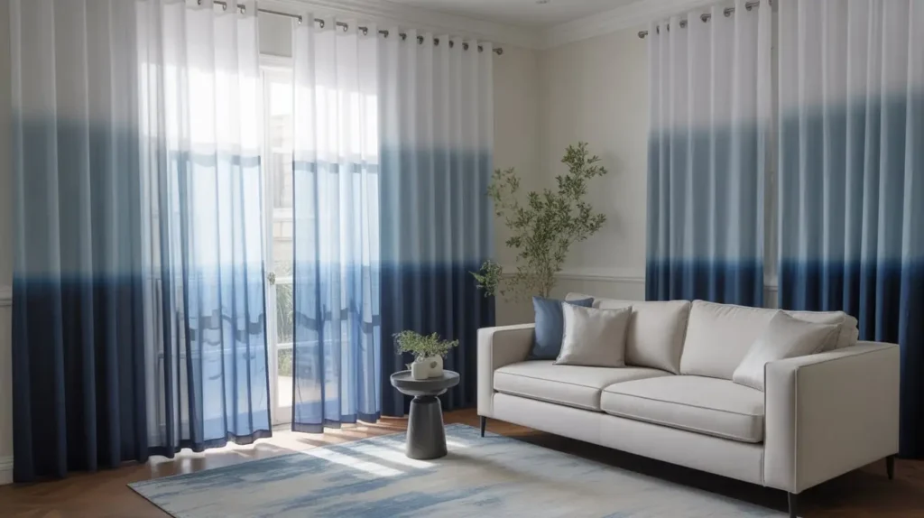
Why settle for one shade of blue when you can have them all? Ombre curtains, which feature a gradual transition from one color to another, are a fantastic way to add a unique, artistic touch to your living room. A blue ombre that fades from a deep navy at the top to a pale sky blue at the bottom (or vice versa) is particularly striking.
Why It Works in a Modern Home
Ombre is all about movement and visual flow. It adds a dynamic element that is both modern and playful. In a living room, it can serve as a piece of art in its own right. It’s a way to incorporate multiple shades of blue without the room feeling choppy or disjointed, as the colors blend seamlessly into one another.
This style is perfect for adding a soft, watercolor-like effect to your walls, which can be a beautiful counterpoint to the hard lines of modern furniture.
How to Style It Like a Pro
Since the curtains themselves are a major design statement, it’s best to keep the rest of the room relatively simple.
- Orientation Matters: Think about how you want the gradient to flow. A dark-to-light gradient (dark at the top) can make the ceiling feel higher. A light-to-dark gradient (light at the top) can feel more grounding.
- Pull Colors from the Curtain: Decorate the rest of the room using the shades found in your ombre curtain. For example, if it goes from navy to white, use a navy sofa, light blue pillows, and white accents.
- Hardware: A simple, unobtrusive rod is best. You don’t want the hardware competing for attention with the gradient effect. A simple silver or white rod works perfectly.
My Two Cents
Ombre had a moment a few years back, and sometimes it can look a little dated if not done right. The key to keeping it modern is to choose a high-quality fabric where the gradient is subtle and well-blended, not a harsh, chunky transition. Avoid cheap-looking prints and opt for dip-dyed fabrics for a more authentic, artistic feel.
9. Soft Blue Scandinavian Style
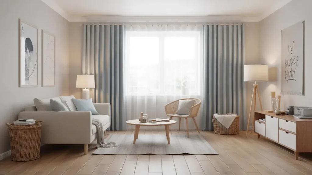
Scandinavian design is all about hygge—that feeling of coziness, contentment, and well-being. A soft, dusty blue is the perfect color to evoke this feeling. We’re talking about a blue with a significant amount of gray in it, making it muted, serene, and incredibly easy to live with.
Why It Works in a Modern Home
Scandinavian design is, at its core, a form of modernism. It champions simplicity, functionality, and a connection to nature. Soft blue curtains in a simple, functional style (like a plain panel or a ripplefold) fit this ethos perfectly. They add a touch of color and softness without disrupting the clean, light-filled, and functional nature of a Scandi-inspired room.
How to Style It Like a Pro
Creating a Scandinavian look is all about a bright base, natural materials, and cozy textures.
- Fabric: A natural-looking fabric is a must. Think cotton, a linen blend, or a light wool. The texture should be simple and honest.
- Pair with Light Woods: This shade of blue looks absolutely beautiful paired with the light wood tones common in Scandinavian furniture (like birch, ash, and light oak).
- Cozy It Up: Layer in cozy textures. A sheepskin throw over a chair, a chunky knit blanket on the sofa, and plenty of candles will complete the hygge vibe. Keep the rest of the palette simple with lots of white, gray, and touches of black.
My Two Cents
This is one of the most foolproof looks on the list. It’s incredibly difficult to get wrong. The color is so calming and versatile that it plays well with almost anything. The only potential pitfall is making the room feel too cool-toned. Make sure to balance the cool blue and gray with warm elements like wood, leather, or brass accents.
Read Also 15 Stunning Round Coffee Table Decor Ideas for Modern Living
10. Blue Floral Classic Drapery
Hold on, I know what you’re thinking. Floral? In a modern home? But hear me out. We’re not talking about your grandma’s chintz curtains from the 80s (no offense, Grandma). Modern floral patterns are often large-scale, abstract, or have a painterly quality that feels fresh and artistic.
Why It Works in a Modern Home
A large-scale blue floral print can act like a piece of contemporary art in your living room. It breaks up the monotony of solid colors and straight lines, introducing an element of nature and organic form. It’s a way to be traditional-ish without being stuffy. The key is the scale and style of the print.
When paired with sleek, modern furniture, the contrast is what makes it so compelling. It’s the design equivalent of wearing a vintage floral dress with a sharp leather jacket.
How to Style It Like a Pro
The trick is to make the floral feel intentional and modern, not accidental and dated.
- Choose the Right Print: Look for prints that are large in scale and have a limited color palette. A simple blue and white floral is a classic and easy-to-style choice.
- Keep Furniture Sleek: Pair these curtains with furniture that has very clean lines. A minimalist sofa, a glass coffee table, and simple metallic lamps will let the curtains be the star.
- Pull Colors from the Print: Pick out the shades of blue and any other accent colors from the floral pattern and use them in small doses around the room—in a vase, a book cover, or a throw pillow.
My Two Cents
This is a balancing act. If you have a busy floral curtain, a busy patterned rug, and a dozen patterned pillows, your living room is going to look like it’s having a seizure. Let the curtains be the main pattern. Keep the other elements in the room solid and simple. This look requires restraint.
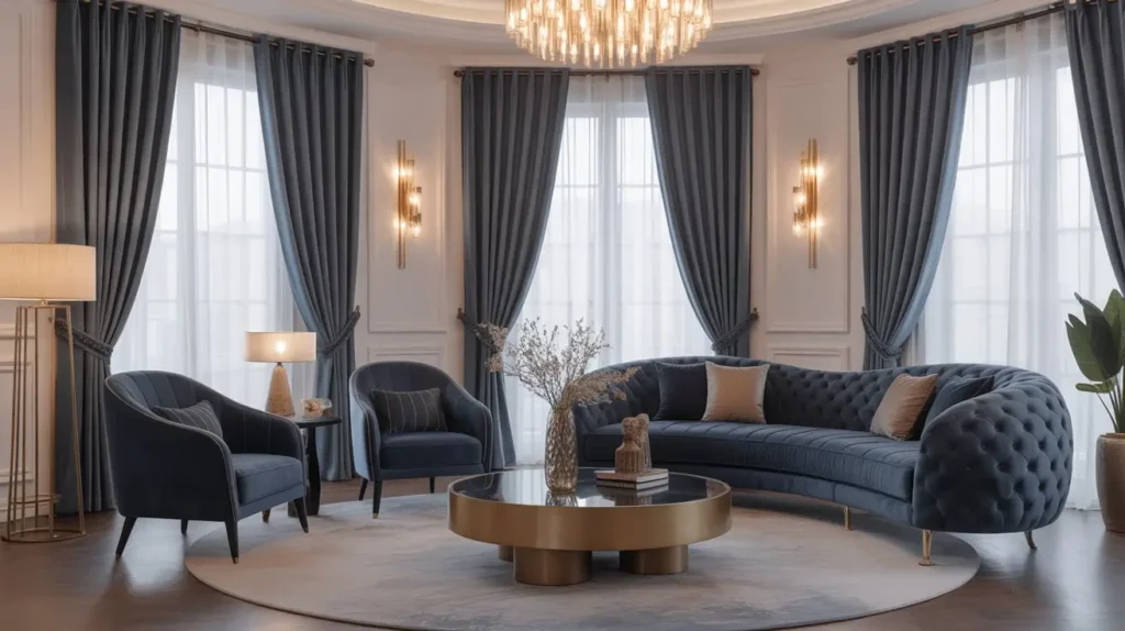
11. Steel Blue Contemporary Look
Steel blue is a sophisticated, moody color. It’s a medium-to-dark blue with a strong gray undertone, reminiscent of a stormy sky. It’s less preppy than navy and more serious than royal blue. In a contemporary setting, it reads as chic, urban, and just a little bit edgy.
Why It Works in a Modern Home
Contemporary design often embraces a moodier, more complex color palette than pure modernism. Steel blue fits this perfectly. It’s a color with depth and character that can make a living room feel grounded and sophisticated.
It works beautifully in industrial-style or loft-like spaces, complementing materials like concrete, exposed brick, and metal.
How to Style It Like a Pro
To nail this look, you want to create a space that feels curated and polished, with a touch of industrial grit.
- Fabric and Finish: A fabric with a slight sheen, like a silk-blend or a high-quality sateen, can look incredible in this color, as it catches the light beautifully. A matte finish, like a heavy cotton twill, can also work for a more understated look.
- Hardware: Matte black or dark gunmetal gray hardware enhances the cool, industrial feel.
- Pairings: This color looks fantastic with a range of grays, from light silver to deep charcoal. It also pairs well with warm wood tones (like walnut) and rich leather to add warmth and prevent the room from feeling too cold.
My Two Cents
Like navy, steel blue is a darker color that can make a room feel smaller if you’re not careful. Ensure you have ample lighting—both natural and artificial. A striking floor lamp or a modern chandelier can act as a piece of “jewelry” for the room and help to brighten things up.
12. Blue Geometric Modern Prints
If you love clean lines and bold statements, geometric print curtains are for you. Think chevrons, hexagons, interlocking squares, or simple stripes. A blue and white geometric pattern is a particularly crisp and classic combination that feels both modern and timeless.
Why It Works in a Modern Home
Geometric patterns are a natural fit for modern design, which is itself based on form and line. These curtains can reinforce the linear quality of modern furniture and architecture. They add visual interest and a sense of rhythm to a room without being overly fussy.
A bold geometric print can act as the primary “wow” factor in an otherwise simple room, instantly giving it a designer feel.
How to Style It Like a Pro
The key is to let the pattern do the talking and keep other elements from competing.
- Scale is Everything: For a modern look, it’s often better to go with a larger-scale pattern. A tiny, busy pattern can look dated and fussy.
- Stick to a Simple Color Palette: A two-color print, like navy and white or sky blue and cream, is the easiest to work with. It keeps the look clean and graphic.
- Echo the Shapes: You can subtly echo the geometric shapes from the curtains elsewhere in the room. For example, if you have hexagonal print curtains, consider a hexagonal mirror or side table. It’s a subtle touch that makes the design feel cohesive.
My Two Cents
A little bit of a bold geometric pattern goes a long way. These curtains are a major statement. If you’re pattern-shy, this might not be for you. Also, be mindful of how the pattern looks when the curtains are open and stacked to the side—sometimes a beautiful flat pattern can look like a jumbled mess when it’s bunched up.
13. Turquoise Coastal Chic
If the “Coastal Blue Linen Breeze” was a quiet day at the beach, turquoise is a vibrant, fun-filled day in the Caribbean. Turquoise is an energetic and joyful color that instantly makes a room feel more lively and playful. It’s the perfect choice for a home that doesn’t take itself too seriously.
Why It Works in a Modern Home
This look is a more vibrant, modern take on coastal decor. While traditional coastal is all about muted tones, this “Coastal Chic” look embraces bold, saturated color. Turquoise provides a brilliant pop of color that looks stunning against a clean, white backdrop, which is a hallmark of many modern homes.
It’s a way to bring a vacation vibe into your home that feels fresh and contemporary, not kitschy.
How to Style It Like a Pro
Think of a modern Miami or a Greek island villa for inspiration.
- Keep the Background White: To make the turquoise truly pop, the walls and major furniture pieces should be crisp white.
- Natural Textures: Ground the bright color with lots of natural textures. Think jute rugs, rattan furniture, and light wood accents.
- Accent with Coral or Yellow: Turquoise looks amazing when paired with other vibrant, warm colors. A pop of coral, sunny yellow, or even hot pink in your throw pillows or art can create a fun, high-energy look.
My Two Cents
Turquoise is a very specific and very strong color. It’s not for everyone. If you’re not 100% in love with it, it can quickly become overwhelming. Start small if you’re unsure—maybe with a few turquoise throw pillows—before you commit to full-length curtains.
14. Midnight Blue Blackout Style
Let’s get practical for a moment. Sometimes, you just need a room to be dark. Whether it’s for a living room that doubles as a home theater or because the afternoon sun turns your space into a sauna, blackout curtains are a lifesaver. But practical doesn’t have to mean ugly. A deep, inky midnight blue blackout curtain can be both incredibly functional and stunningly beautiful.
Why It Works in a Modern Home
Functionality is a key tenet of modern design. A curtain that not only looks good but also improves your quality of life (by blocking light, insulating the room, and reducing noise) is the ultimate modern accessory. Midnight blue is a sophisticated alternative to basic black, offering a similar depth but with a bit more color and character.
How to Style It Like a Pro
Even though their main job is functional, you can still make them look amazing.
- Get the Right Size: To be effective, blackout curtains need to be wider and longer than your window frame. This prevents those annoying slivers of light from peeking around the edges.
- Invest in Quality: Not all blackout curtains are created equal. Look for a thick, heavy fabric with a built-in lining. A good quality midnight blue fabric will look rich and luxurious, not like a cheap hotel curtain.
- Elegant Hardware: Pair them with a substantial rod in a finish like brushed nickel or dark bronze to support their weight and match their sophisticated vibe.
My Two Cents
Good blackout curtains are heavy. Make sure your curtain rod is installed securely into studs in the wall, not just drywall. The last thing you want is to be woken up by the sound of your entire curtain setup crashing to the floor. Trust me on this one. :/
15. Blue + White Striped Nautical Curtains
Last but not least, an absolute classic. Blue and white stripes are cheerful, crisp, and timeless. While they immediately evoke a nautical or coastal feel, they can be styled in a way that feels perfectly at home in a modern living room.
Why It Works in a Modern Home
Stripes are a form of geometric pattern, and they bring a clean, graphic quality to a space. Vertical stripes can make your ceilings feel higher, while horizontal stripes can make a room feel wider. It’s a simple optical illusion that designers use all the time.
In a modern context, a simple blue and white stripe feels less “theme-y” and more like a classic, preppy, and polished design choice.
How to Style It Like a Pro
The key is to lean into the crispness of the stripe without turning your living room into a pirate ship.
- Stripe Size: The width of the stripe matters. A wider, “cabana” stripe often feels more modern and less busy than a very thin pinstripe.
- Keep It Simple: Since the curtains have a pattern, keep the rest of the room fairly simple. A comfortable white or gray sofa, a simple wood coffee table, and a solid-colored rug work beautifully.
- Add Warmth: Blue and white can feel a bit cool. Warm it up with accents of red (for a classic nautical look), natural leather, or warm wood tones.
My Two Cents
This is a look that can easily go from chic to cheesy if you overdo it. One or two nautical-themed items are fine (like a piece of coral on a shelf), but if you add a ship’s wheel, an anchor-print rug, and a net full of seashells, people might think they’ve walked into a seafood restaurant. Exercise a little restraint.
So, What’s the Verdict?
Phew! We’ve journeyed through the entire spectrum of blue, from the palest sky to the deepest midnight. The big takeaway here is that “blue curtains” isn’t a single idea—it’s a launchpad for dozens of different styles and moods.
Whether you’re a die-hard minimalist, a free-spirited bohemian, or someone who just wants to watch a movie in total darkness, there’s a perfect blue curtain out there waiting for you. The key is to think about the feeling you want to create in your living room and choose a style that supports that vision.
Now go on, get some fabric swatches. Your living room’s fabulous future is waiting. Good luck