
Alright, let’s have a real chat. You, me, and that big, blank dining room wall that’s currently staring back at you. You know the one. It’s the wall that watches you eat your sad desk-lunch leftovers and silently judges your choice of takeout for the third night in a row. It’s seen you host triumphant holiday dinners and… less-than-triumphant attempts at baking. And right now, it’s just… empty.
Honestly, decorating a dining room wall feels like a high-stakes game, doesn’t it? This is a space for entertaining, for making memories, for convincing your in-laws that you totally have your life together. The pressure is real. I’ve been there, scrolling endlessly through Pinterest, feeling a unique blend of inspiration and total paralysis.
But here’s the good news: that blank canvas isn’t a problem. It’s an opportunity. It’s your chance to inject some serious personality into a room that often gets overlooked. So, grab a coffee (or something stronger, I’m not judging), and let’s walk through some seriously chic ideas. I’ve curated 15 concepts that range from bold and dramatic to subtle and sophisticated, and I’ll give you the real-deal scoop on how to make them work.
1. Oversized Abstract Art Statement
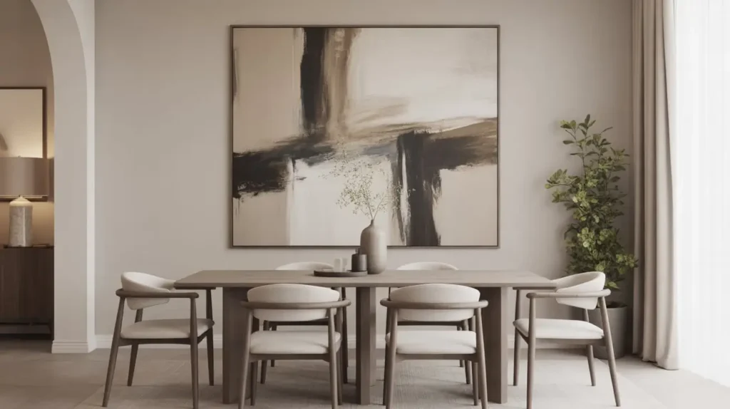
Let’s just rip the band-aid off and start with the boldest move of them all: a massive piece of abstract art. We’re talking about a canvas so big it practically becomes the fifth wall in your room. This isn’t just decor; it’s a declaration.
This single, powerful piece does all the heavy lifting for you. It provides color, texture, and a focal point, all in one go. No need to mess around with a dozen smaller frames or worry about perfect spacing. You just find one piece that speaks to you, hang it up, and boom—instant drama and sophistication.
Why I Absolutely Love This Look
An oversized abstract piece is the ultimate conversation starter. Your guests will either love it or be completely mystified by it, and either way, they’ll be talking. It adds a layer of artistic credibility to your space that’s hard to achieve otherwise. It says, “I’m confident, I have a point of view, and I’m not afraid of a little color.” Plus, a large vertical piece can make a room with standard-height ceilings feel much taller.
Getting It Right (Tips & Tricks)
- Scale is Everything: This is not the time for modesty. The artwork should be at least two-thirds the length of your dining table or sideboard. Anything smaller will look like a postage stamp on an envelope.
- Color Palette: Use the art as your color guide for the rest of the room. Pull two or three accent colors from the canvas and sprinkle them around in your centerpiece, napkins, or even a rug. This creates a cohesive, professionally designed feel.
- Framing: Often, a simple gallery frame or even an unframed canvas wrap works best. You want the art itself to be the star, not a clunky, ornate frame. A thin, black or metallic float frame is almost always a winning choice.
A Word of Caution
Let’s be real: large-scale art can be an investment. If you’re a bit of a commitment-phobe when it comes to decor, dropping a few grand on a painting might give you hives. Also, make sure you genuinely love the piece. You’re going to be looking at it a lot, so you don’t want to be stuck staring at a bunch of squiggles you secretly hate.
2. Minimalist Black-and-White Wall Gallery
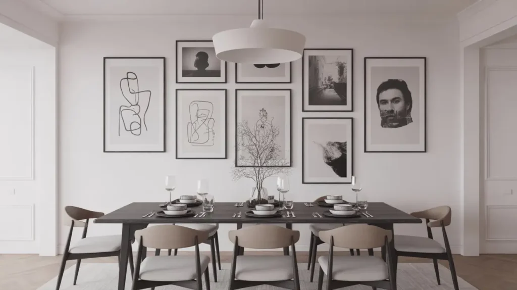
If the idea of a giant, colorful abstract painting makes you break out in a cold sweat, let’s pivot to its cool, collected cousin: the minimalist black-and-white gallery wall. This is the epitome of timeless chic. It’s structured, it’s sophisticated, and it has an intellectual vibe that feels effortlessly cool.
Think of it as a personal photo exhibit, but with a strict dress code. By removing color, you force the eye to focus on composition, form, and emotion. It’s less “Look at my fun beach vacation!” and more “Behold, the poignant architecture of my life.” A little dramatic? Maybe. But it works.
Why I Absolutely Love This Look
A black-and-white gallery wall is incredibly versatile. It works with almost any color scheme—from moody and dark to light and airy. It also brings a sense of order and calm to a space. Unlike a chaotic, multi-colored gallery wall, this approach feels intentional and curated. It’s the perfect backdrop for lively dinner parties because it adds interest without competing for attention.
Getting It Right (Tips & Tricks)
- Consistency is Key: The secret sauce here is uniformity. Use identical frames for every single picture. Thin black, white, or even natural wood frames work beautifully. This creates the grid-like, cohesive look you’re going for.
- The Power of the Mat: Don’t skimp on the matting! A wide, crisp white mat around each photo creates breathing room and makes the entire arrangement look more expensive and professional.
- Layout is Non-Negotiable: This is not the time to “eyeball it.” Trust me, I’ve tried. My spirit level and I are no longer on speaking terms because of it. Measure everything, use painter’s tape to map out your grid on the wall beforehand, and make sure the spacing between each frame is perfectly consistent.
A Word of Caution
This look can lean a bit sterile or cold if you’re not careful. To counteract this, make sure you have plenty of warmth and texture elsewhere in the dining room—a plush rug, wood furniture, or upholstered chairs can strike the perfect balance.
3. Modern Mirror Wall Arrangement
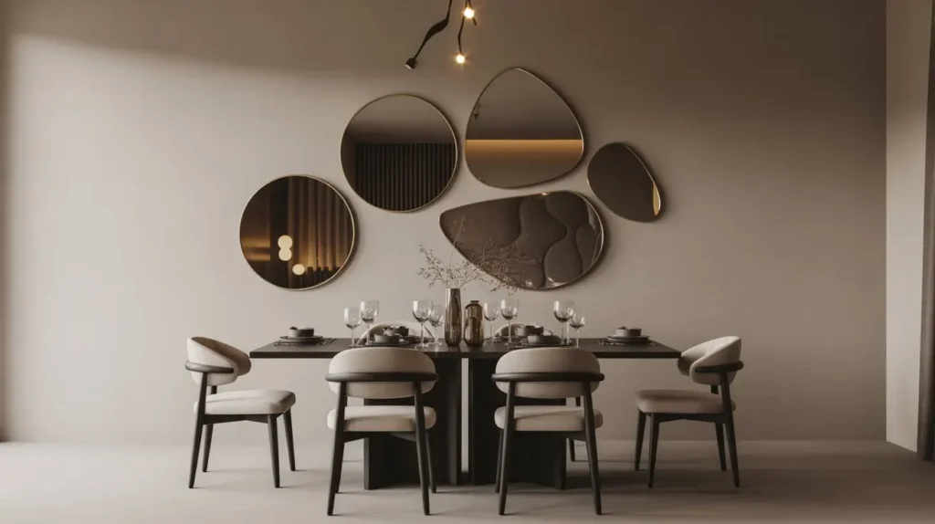
Ah, the mirror. It’s the oldest interior design trick in the book for a reason: it works. Mirrors bounce light around, make a space feel larger and brighter, and add a touch of glamour. But we’re not talking about one sad, rectangular mirror plonked in the middle of the wall. We’re talking about a curated arrangement of mirrors.
Think of them as pieces of reflective art. You can group several together to create a dynamic, sculptural focal point that’s both functional and beautiful. It’s a fantastic solution for smaller or darker dining rooms that need a little help.
Why I Absolutely Love This Look
I’m a huge fan of anything that’s both pretty and practical. A mirror arrangement checks both boxes. It’s decor that actively works to improve your space. It can double the impact of a beautiful light fixture by reflecting it, or it can showcase a view from an adjacent window. It’s like getting a two-for-one deal on your decor.
Getting It Right (Tips & Tricks)
- Mix or Match: You have two main paths here. For a more eclectic, collected vibe, mix different shapes, sizes, and frame styles (e.g., round, arched, sunburst). For a clean, modern look, use a grid of identical mirrors.
- Consider the Reflection: This is the most important rule. Before you hang a single mirror, stand where it will be and see what it reflects. You want it to reflect something beautiful, like your chandelier, a piece of art on the opposite wall, or a window. You do not want it reflecting a cluttered kitchen counter or the doorway to the bathroom.
- Arrangement is Art: Lay your mirrors out on the floor first to play with the arrangement before you start making holes in the wall. Think of it like a puzzle, finding the right balance and flow between the different shapes.
A Word of Caution
Mirrors show every single smudge and fingerprint. If you have small children or are just generally averse to cleaning, a wall of mirrors might become your mortal enemy. Also, be mindful of placement in relation to your dining table—no one wants to watch themselves chew. :/
4. Rustic Wood Panel Accent Wall

Ready to bring in some serious warmth and texture? A wood panel accent wall can completely transform a dining room from a plain white box into a cozy, inviting haven. This look channels everything from a rustic mountain lodge to a chic, modern farmhouse, depending on the type of wood and installation you choose.
Whether you go for reclaimed barn wood with all its history and imperfections, or sleek, modern wood slats for a Scandinavian vibe, this idea is all about celebrating a natural material. It’s an architectural feature that doubles as decor.
Why I Absolutely Love This Look
There’s something so grounding and comforting about a wood wall. It adds an organic element that so many modern homes lack. I find it makes a dining room feel instantly more intimate and welcoming. Plus, it’s a fantastic way to hide a wall that’s in less-than-perfect condition without having to replaster. Genius, right?
Getting It Right (Tips & Tricks)
- Choose Your Wood Wisely: The type of wood dictates the entire mood. Reclaimed wood with knots and a varied patina screams rustic farmhouse. Thin, light-colored wood slats (like oak or maple) installed vertically feel very contemporary and Japandi-inspired.
- Horizontal vs. Vertical: Horizontal planks will make the room feel wider, while vertical planks will make the ceiling feel higher. Choose the orientation that best serves your room’s proportions.
- DIY or Hire a Pro?: Many companies now sell easy-to-install peel-and-stick wood planks, making this a totally achievable weekend DIY project. However, for a more complex pattern like herringbone or a full wall of heavy reclaimed wood, it’s probably best to call in a professional.
A Word of Caution
A wood wall is a significant commitment. It’s not as easy to change as a coat of paint. Make sure you’re truly in love with the look before you start. Also, a wall of very dark, heavy wood can make a small or poorly lit room feel a bit like a cave, so assess your natural light situation honestly.
Read Also 15 Stunning Dining Room Wallpaper Ideas and Chic Style Tips
5. Floating Shelves With Curated Decor
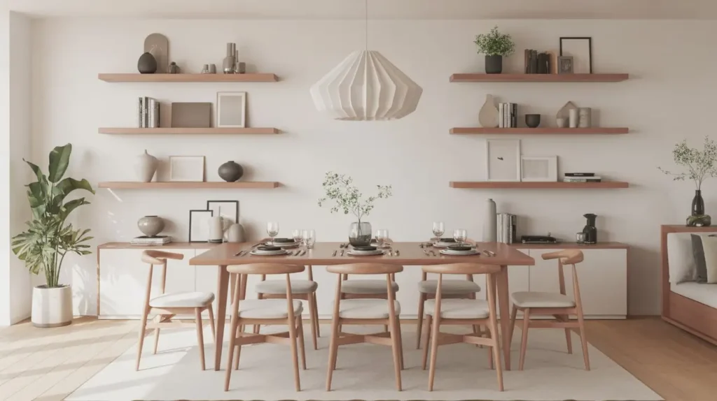
If you’re a collector at heart, this one’s for you. Floating shelves offer the perfect stage to display your favorite objects—without the bulk of a traditional bookcase or cabinet. This is your chance to create a rotating mini-museum of things that bring you joy.
The key word here is curated. This isn’t a free-for-all for every knick-knack you own. It’s a thoughtful arrangement of pottery, small plants, framed photos, and meaningful objects that, when combined, tell a story about you.
Why I Absolutely Love This Look
I love how personal and flexible this option is. It’s decor that can evolve with you. Tired of the look? Swap a few items out, and you have a whole new vibe. It’s also incredibly practical for adding a touch of storage and personality, especially in smaller dining areas where a large piece of furniture would be overwhelming.
Getting It Right (Tips & Tricks)
- The Rule of Three: When styling, group items in odd numbers, particularly threes. A stack of three small books, a trio of little vases, etc. It’s a design principle that just… works. It creates a sense of balance that’s visually pleasing.
- Vary Height and Texture: The most interesting shelf displays have a mix of elements. Combine something tall (a vase with a single stem), something short and stout (a small bowl), and something organic (a trailing plant). Mix smooth ceramics with rough-textured objects.
- Negative Space is Your Friend: Do not, I repeat, do not cram the shelves full. Leave plenty of empty space to let each object breathe. Overcrowding is the fastest way to go from “chic and curated” to “cluttered and chaotic.”
A Word of Caution
Floating shelves require a certain level of self-control. If you have a tendency to let surfaces accumulate junk (no judgment!), you might find your beautiful display quickly becomes a drop-zone for keys, mail, and random odds and ends. Regular dusting is also a must.
6. Botanical Framed Print Series
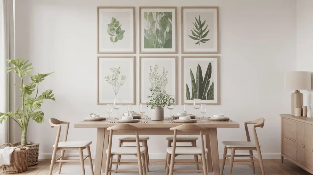
Bring the outdoors in with a beautifully arranged series of botanical prints. This is a classic look that never goes out of style. It adds a touch of life and freshness to a dining room, creating a serene and calming atmosphere.
You can go for vintage-style scientific illustrations of ferns and flowers, or modern, graphic interpretations of leaves and palms. Arranged in a neat grid, a series of these prints creates a cohesive and impactful statement that’s sophisticated yet approachable.
Why I Absolutely Love This Look
This is one of the easiest ways to create a high-impact gallery wall. Because the subject matter is consistent, it feels unified even if the individual prints are different. It’s also a gentle way to introduce color and pattern into a room without committing to a wild wallpaper or a bold piece of art. It’s just… pleasant. And sometimes, pleasant is exactly what a dining room needs.
Getting It Right (Tips & Tricks)
- Create a Set: The most effective botanical walls feature a set of prints. This could be a series of six, eight, or even nine frames arranged in a perfect grid. Using the same frame and mat for all of them is crucial for that polished, intentional look.
- Find Your Style: Do you prefer detailed, antique-style drawings or simple, modern silhouettes? There are tons of options available online, from affordable digital downloads on Etsy to high-end print sets.
- Scale Accordingly: The overall size of your grid should be in proportion to your wall and furniture. A tiny grid of four small prints above a massive sideboard will look lost. Map it out with painter’s tape first to get a feel for the scale.
A Word of Caution
Make sure the style of the prints complements the style of your dining room. Super modern, graphic leaf prints might look a bit odd in a very traditional, antique-filled room, and vice-versa. It’s about harmony.
7. Textured Woven Wall Hangings
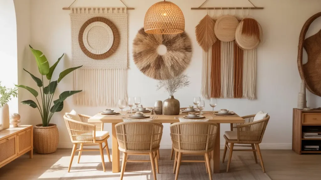
Move over, paintings! Macramé and other woven wall hangings are having a major moment, and for good reason. They add a layer of texture, softness, and bohemian charm that you just can’t get from a flat piece of art.
From large-scale, intricate macramé pieces to simpler, modern weavings in neutral tones, these hangings bring a handmade, artisanal quality to a space. They’re perfect for warming up a minimalist room or fully leaning into a relaxed, boho-chic aesthetic.
Why I Absolutely Love This Look
Two words: sound absorption. Dining rooms can be noisy, echo-y spaces, especially in open-concept homes with lots of hard surfaces. A large fabric or woven wall hanging actually helps to dampen sound, making conversations more pleasant. It’s beautiful and functional. What’s not to love? IMO, this is one of the most underrated benefits.
Getting It Right (Tips & Tricks)
- Go Big: Like with oversized art, a small, sad little macramé hanging will look out of place. Choose a piece that makes a statement and has a real presence on the wall.
- Consider Color and Material: Neutral tones like cream, beige, and charcoal are versatile and timeless. If you want a pop of color, look for weavings that incorporate dyed wool or other fibers. The texture of the material—be it chunky wool, soft cotton, or natural jute—is just as important as the design.
- DIY Potential: Feeling crafty? Macramé is a very accessible craft to learn, and making your own wall hanging can be a rewarding project that results in a truly one-of-a-kind piece for your dining room.
A Word of Caution
These can be dust magnets. They’ll need an occasional gentle shake-out or a once-over with the upholstery attachment of your vacuum cleaner. Also, be mindful of the style—a very intricate, fringe-heavy macramé piece might feel a bit too “college dorm room” if not balanced with more sophisticated furniture.
8. Metallic Sculptural Wall Art

Want to add a little bit of glitz and glam without resorting to glitter? Metallic sculptural wall art is your answer. These three-dimensional pieces, often made of brass, iron, or polished chrome, play with light and shadow to create a dynamic focal point.
Think of abstract metal sunbursts, a flock of delicate brass birds, or geometric wire forms. They add a touch of modern luxury and can make a room feel instantly more polished and upscale.
Why I Absolutely Love This Look
I’m obsessed with how these pieces interact with light. As the natural light in the room changes throughout the day, or as you dim the lights for dinner, the sculpture shifts and changes, casting interesting shadows and catching the light in different ways. It’s living, breathing art for your wall.
Getting It Right (Tips & Tricks)
- Match Your Metals (Loosely): It’s a good idea to have the metal on your wall sculpture relate to other metals in the room, like your light fixture or the hardware on your sideboard. They don’t have to be an exact match—mixing a warm brass with a matte black is very chic—but they should feel like they’re in the same family.
- Let It Stand Alone: A sculptural piece is often dramatic enough to be the only thing on the wall. Don’t crowd it with other art. Give it the space it deserves to be the star.
- Placement Matters: Hang it where it will catch the light beautifully—either from a window or from your dining room chandelier.
A Word of Caution
Some of the cheaper, mass-produced metal sculptures can look… well, cheap. It’s worth investing in a piece that feels substantial and well-made. Also, like mirrors, they can show fingerprints, so try to handle them by the edges during installation.
9. Large Framed Dining Quote Typography
Okay, stay with me here. I know that as soon as I say “quote art,” your mind might jump to a cringey “Live, Laugh, Love” sign. But we can do so much better than that. A large, beautifully designed piece of typography can be incredibly stylish and personal.
The key is to choose a quote that genuinely means something to you, or one that’s clever, witty, or unexpected. It could be a line from your favorite poem, a family motto, a funny saying about food, or even the coordinates of a meaningful place. When framed and presented as a serious piece of art, it becomes a reflection of your personality.
Why I Absolutely Love This Look
This is, without a doubt, the most personal option on the list. It’s a way to literally spell out what’s important to you. I have a friend who has a Julia Child quote—”People who love to eat are always the best people”—in a gorgeous, oversized font in her dining room. It sets the perfect tone for a dinner party: fun, unpretentious, and all about good food and good company.
Getting It Right (Tips & Tricks)
- Font is Everything: The font you choose will completely define the mood. A classic serif font feels traditional and elegant. A clean, bold sans-serif font feels modern and graphic. A script font feels more personal and romantic. Choose a font that matches the vibe of your home.
- Invest in Quality Printing and Framing: Don’t just print it on your home printer. Get it professionally printed on high-quality, archival paper. And just like with other art, a great frame and mat will elevate it from a poster to a piece of art.
- Less is More: Keep the design simple. Often, just the text on a clean background is the most powerful approach. Let the words themselves be the art.
A Word of Caution
Please, for the love of all that is chic, be original. If you can buy it on a mass-produced wooden sign at a big-box store, it’s probably not the unique, personal statement you’re going for. This is about expressing your personality, not a generic sentiment.
Read Also 15 Stunning Moody Dining Room Ideas for Dramatic Style
10. Geometric 3D Wall Panels
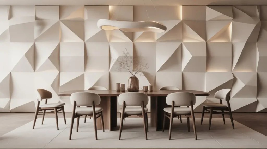
For the true modernist who craves architectural detail, 3D wall panels are a game-changer. These are modular panels, often made of plant fiber, gypsum, or PVC, that feature repeating geometric patterns. When installed on a wall, they create a stunning, textured surface that plays with light and shadow.
The effect is subtle yet incredibly impactful. It adds depth and interest to a wall without using any color or pattern in the traditional sense. It’s a backdrop that feels both futuristic and timelessly architectural.
Why I Absolutely Love This Look
It’s just so cool. It’s unexpected. A 3D paneled wall makes a room feel custom-built and high-end. It provides all the impact of an accent wall without screaming for attention. I especially love them when they’re painted the exact same color as the other walls in the room—it creates a seamless, textural experience that is pure, understated luxury.
Getting It Right (Tips & Tricks)
- Paint is a Game-Changer: While the panels often come in a standard white, painting them is what truly integrates them into your space. A deep charcoal, a moody navy, or even the same neutral as your other walls will highlight the shadows and make the pattern pop.
- Installation Precision: This is another project where precision is paramount. The panels need to be perfectly aligned for the pattern to look seamless. While many are designed for DIY installation, if you’re not confident with a level and adhesive, this is a job for a pro.
- Lighting is Key: The beauty of 3D panels is how they interact with light. Consider installing wall-washing lights or an art light above the wall to graze the surface and accentuate the three-dimensional pattern.
A Word of Caution
This is a very permanent-feeling installation. While some panels can be removed, it’s often a process that will require some wall repair. Also, the style is distinctly modern. If your home leans traditional or rustic, this look might feel out of place.
11. Vintage Plate Wall Display
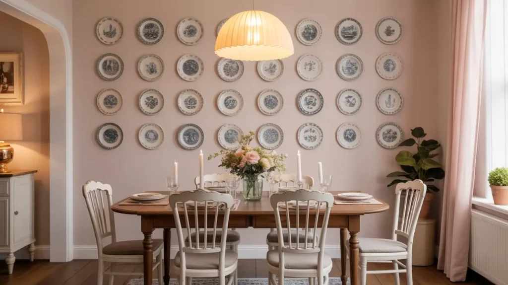
Before you roll your eyes and picture your grandma’s dusty dining room, hear me out. A wall of vintage plates can be incredibly chic, whimsical, and cool—when done right. It’s about taking a traditional concept and giving it a fresh, modern twist.
The secret is in the curation and arrangement. Instead of stuffy, matching floral china, think about a collection of mismatched blue-and-white plates, quirky illustrated plates, or even modern, graphic ceramic pieces. Arranged in a free-flowing, organic cluster, it feels less like a formal display and more like a burst of personality. Your grandmother’s dusty collection just got a promotion. 🙂
Why I Absolutely Love This Look
It’s a celebration of craft and history. Each plate has its own story. It’s also a fantastic way to add color, pattern, and a touch of the unexpected to your dining room. I love how it’s a nod to tradition but can feel completely contemporary. Plus, it’s a great excuse to spend weekends treasure-hunting at thrift stores and flea markets.
Getting It Right (Tips & Tricks)
- Find a Common Thread: Your collection will look most cohesive if there’s a common element tying it together. This could be a color scheme (e.g., all blue and white), a theme (e.g., all bird illustrations), or a shape (e.g., all round plates of different sizes).
- Plan Your Layout: Just like with a gallery wall, lay all your plates out on the floor first to create an arrangement you love. Start with the largest plate in the center or just off-center and build outwards, creating a balanced but not perfectly symmetrical cluster.
- Use Proper Hangers: Don’t rely on flimsy picture hooks. Use sturdy, spring-loaded plate hangers or adhesive disc hangers designed specifically for this purpose to ensure your treasures stay securely on the wall.
A Word of Caution
Dusting. Yes, dusting again. Those little plate ledges are prime real estate for dust bunnies. Also, this look can quickly veer into “country kitsch” territory if the plates are too cutesy or the arrangement is too predictable. The key is to keep it feeling fresh and a little bit quirky.
12. Contemporary Triptych Canvas Set
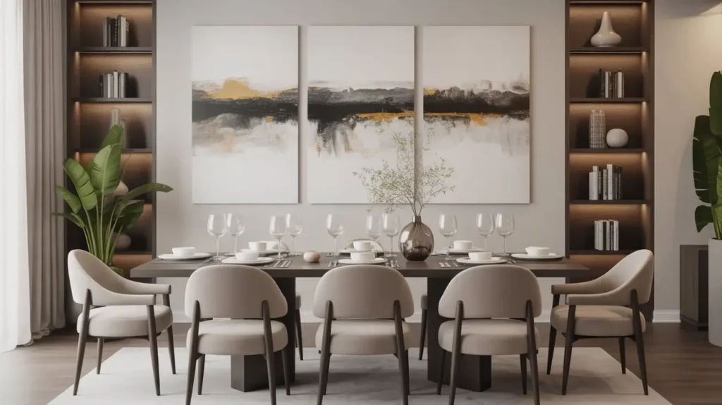
A triptych (pronounced ‘trip-tick’) is a piece of art that is divided into three sections. It’s a concept that dates back to early Christian art, but in a modern context, it’s a super stylish way to fill a large, empty wall.
A contemporary triptych could be a single image—like a landscape or an abstract design—split across three canvases, or it could be three separate but related pieces that are designed to be displayed together. The result is a cohesive, rhythmic statement that has more presence than a single canvas but feels more organized than a multi-piece gallery wall.
Why I Absolutely Love This Look
A triptych offers the scale of an oversized piece of art but with a bit more architectural interest. The small gaps between the canvases break up the surface and create a sense of rhythm and movement. It’s a great solution for the wall behind a long dining table, as it mirrors the table’s length and creates a beautiful sense of balance.
Getting It Right (Tips & Tricks)
- Spacing is Crucial: The space between the panels is part of the art. A consistent gap of 1 to 3 inches between each canvas is standard. Use a level and a tape measure to get this perfect—any inconsistency will be glaringly obvious.
- Choose the Right Subject: Abstract art and sweeping landscapes work particularly well as triptychs because they can be easily divided without losing their impact. A portrait, on the other hand, can look a bit awkward when sliced into three.
- Consider Orientation: A horizontal triptych is a classic choice for a dining room, emphasizing the length of the space. However, a vertical triptych can be a stunning and unexpected choice for a wall with high ceilings.
A Word of Caution
Hanging a triptych requires three times the measuring and leveling of a single piece of art. It’s a bit more work to get it right, but the payoff is worth it. Just make sure you have the patience (and maybe a helpful partner) for the installation process.
13. Earthy Stone-Inspired Wall Mural
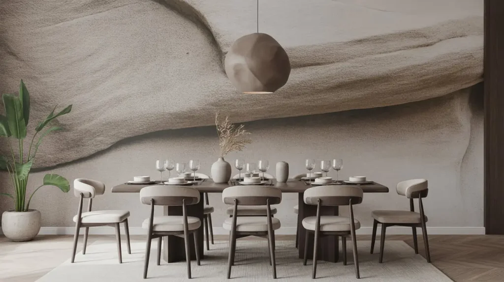
If you want to make a truly jaw-dropping statement, a wall mural is the way to go. We’re not talking about cheesy forest scenes from the 1970s. Today’s murals are sophisticated, artistic, and incredibly realistic. An earthy, stone-inspired mural—like one that mimics the look of aged plaster, concrete, or a stunning slab of marble—can add incredible depth and texture.
This is a way to get the high-end look of a real stone or plaster wall without the astronomical cost and complex installation. It’s an illusion, but it’s a very, very convincing one.
Why I Absolutely Love This Look
It’s pure drama. A full-wall mural completely changes the atmosphere of a room, transporting you somewhere else. A marble mural can make a room feel impossibly grand and luxurious, while a concrete or aged plaster mural can give it an edgy, industrial, or old-world European feel. It’s a shortcut to major architectural character. FYI, many of these now come in high-quality, removable peel-and-stick versions, making them renter-friendly!
Getting It Right (Tips & Tricks)
- Quality Matters Most: This is not the place to cheap out. A low-resolution, poorly printed mural will look tacky. Invest in a high-quality mural from a reputable company that uses thick, textured paper and high-resolution printing.
- Let It Be the Star: When you have a whole wall acting as a piece of art, you need to let it shine. Keep the other decor on that wall to an absolute minimum—or better yet, nothing at all.
- Prep Your Wall: For the best results, especially with peel-and-stick versions, your wall needs to be perfectly smooth, clean, and primed. Any bumps or imperfections will show through.
A Word of Caution
Installation can be tricky. It requires patience, precision, and a very steady hand to line up the panels perfectly. If you’re not a confident DIYer, this is a job worth hiring out. Also, because it’s such a strong statement, make sure it’s a look you can live with for a while.
14. Soft Neutral Fabric Wall Tapestry
Similar to a woven wall hanging, a large fabric tapestry is all about adding softness and texture. But where a macramé piece might lean boho, a simple, large-scale fabric tapestry can feel incredibly modern, minimalist, and serene.
Think of a huge swath of beautiful, high-quality linen, wool, or textured cotton in a soft, neutral color like oatmeal, stone gray, or taupe. Hung simply from a wooden dowel or a sleek metal rod, it becomes a piece of minimalist art that brings warmth and quiet sophistication to a dining room.
Why I Absolutely Love This Look
This is the ultimate in understated elegance. It’s a way to make a big impact on a wall without using any pattern or bright color. The beauty is in the texture of the fabric and the simple, graceful way it hangs. Like other fabric hangings, it also has fantastic sound-dampening qualities, making your dining room a more peaceful place to be. It’s a warm, minimalist hug for your wall.
Getting It Right (Tips & Tricks)
- Fabric Choice is Key: The quality of the fabric is paramount. Look for natural materials with a beautiful drape and texture, like a heavyweight linen or a wool-blend felt. A cheap, synthetic fabric will look flat and uninspired.
- Simple Hanging Method: The way you hang it contributes to the minimalist aesthetic. A simple wooden dowel and some string, or a discreet, modern curtain rod, are perfect choices.
- Steam It: Once hung, your tapestry might have some creases from being folded. Use a handheld garment steamer to gently release the wrinkles and allow the fabric to hang beautifully.
A Word of Caution
Like any fabric, it can hold onto dust and cooking smells. It’s not the best choice for a wall directly adjacent to the kitchen stove, for example. Choose a piece that is either spot-cleanable or can be taken down for an occasional professional cleaning if needed.
15. Framed Architectural Line Drawings
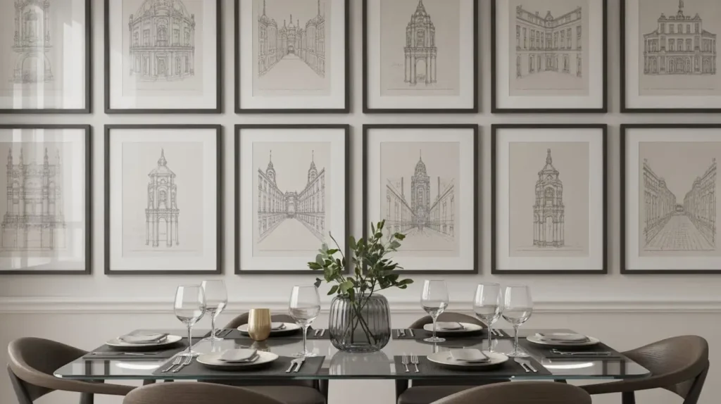
For a look that is intellectual, sophisticated, and clean, consider a series of framed architectural line drawings. This could be anything from classical building elevations and floor plans to modern, abstract architectural sketches.
Arranged in a grid or a simple line, these pieces have a graphic, almost scientific quality that is incredibly chic. They speak of an appreciation for design, history, and precision. It’s a look that feels both classic and completely modern.
Why I Absolutely Love This Look
It’s smart decor. It’s not just pretty; it has substance. It adds a layer of quiet intelligence to a room. The fine lines and intricate details draw you in, giving you something to discover and appreciate up close. In a world of loud, colorful art, the restraint of a simple black-and-white line drawing feels incredibly refreshing and confident.
Getting It Right (Tips & Tricks)
- Cohesive Collection: Like the botanical prints, this look works best as a series. Choose a set of drawings from the same artist, of the same building, or in the same style to create a unified look.
- High-Contrast Framing: This is where you can really make the art pop. A simple black frame with a crisp, wide white mat will provide the perfect contrast for the fine black lines of the drawing.
- Give Them Space: Because the details are so fine, you don’t want to cram these together. Ensure there is ample space between the frames and around the entire arrangement so they don’t just blur into a gray mass from a distance.
A Word of Caution
From across the room, simple line drawings can sometimes lack impact if they are too small or too pale. Make sure the prints are large enough and the lines are dark enough to have a presence on the wall. This is a subtle look, but it shouldn’t be an invisible one.
So, What’s the Verdict?
Phew, we made it! Fifteen ideas, and hopefully, your head is now spinning with possibilities instead of dread. That blank wall isn’t so intimidating anymore, is it?
The most important thing to remember is that your dining room wall is your canvas. It’s a space to reflect who you are and what you love. Whether you’re a bold abstract-lover, a minimalist at heart, or a collector of quirky plates, there’s an idea here that can be tailored to your unique style.
So go forth and decorate. Make a choice, be bold, and hang something up. The worst that can happen is you change your mind later. And trust me, anything is better than letting that wall continue its silent judgment. You’ve got this