

Let’s be real for a second. You’re standing in your kitchen, staring at that bare strip of wall between your countertop and your cabinets, and you feel stuck. Maybe you’re renovating the whole room, or maybe you just want a weekend project that won’t require a second mortgage. You want white. It’s clean, it’s classic, and it makes even a closet-sized kitchen feel like an airy sanctuary. But then the panic sets in. Is white too boring? Will it look like a hospital operating room?
Stop right there. White is anything but boring if you do it right.
I’ve been down this road more times than I care to admit. I’ve argued with contractors about grout lines, obsessively pinned photos at 2 AM, and returned more tile samples than I’ve bought groceries. White backsplashes are the chameleon of kitchen design. They can be rustic, modern, industrial, or glam, all depending on the texture, shape, and layout you choose.
So, grab a coffee (or a glass of wine, I won’t judge), and let’s chat about 15 specific ways you can nail this look. We aren’t just listing tiles here; we are figuring out which one fits your actual life.
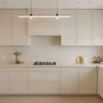
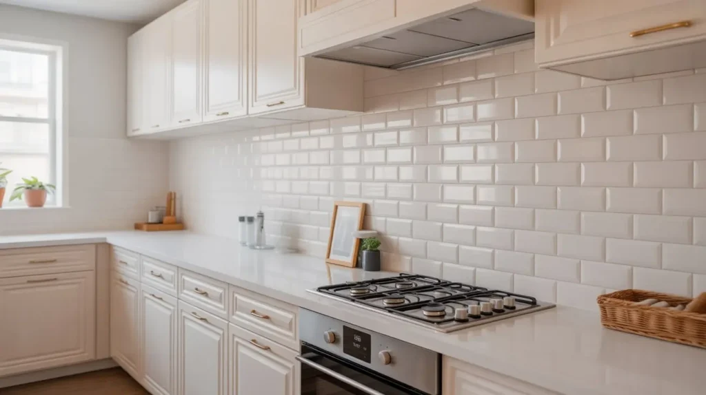
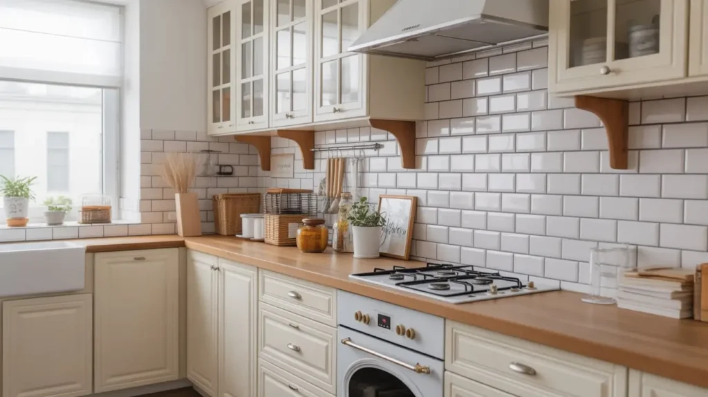
1. Classic White Subway Tile Backsplash

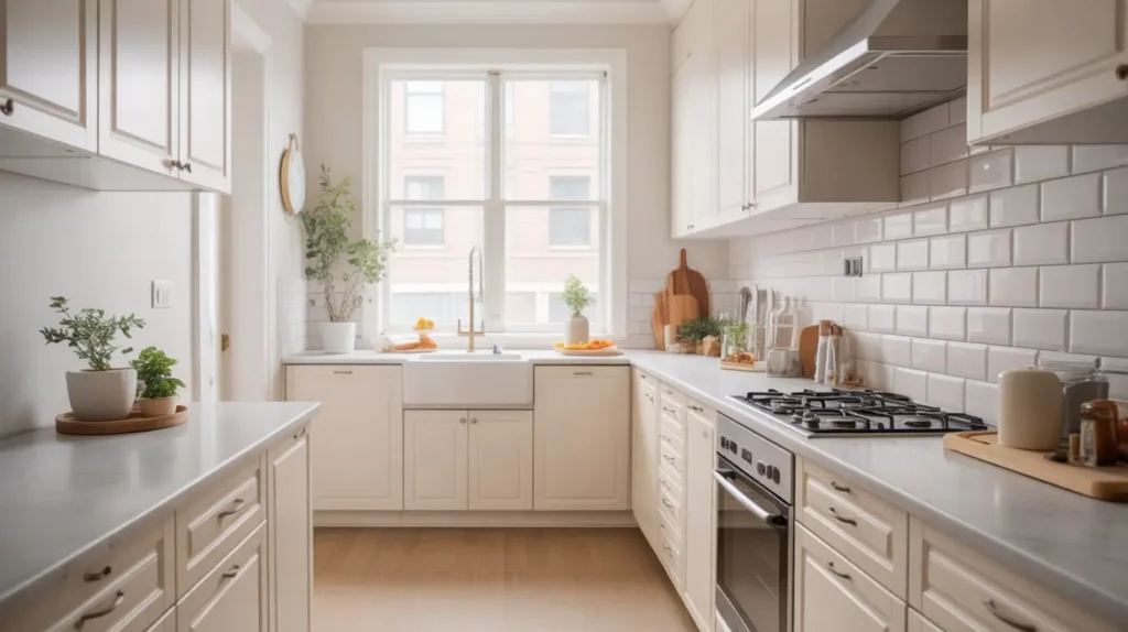
We have to start here. I know what you’re thinking: “Subway tile? Groundbreaking.” But hear me out. There is a reason this style has survived since the Victorian era. It works. It’s the reliable best friend of the design world. It shows up, looks good, and doesn’t demand all the attention.
Why It Never Fails
Standard 3×6 subway tile offers a crisp, sanitary look that fits almost any budget. Seriously, you can find this stuff for pennies on the dollar at big-box stores. But the real magic lies in the versatility. You aren’t stuck with a standard brick pattern. You can stack them vertically for a modern lift or stack them horizontally for a mid-century vibe.
My advice? Don’t overthink the basic option. If you have busy granite countertops or bold cabinet colors, a simple white subway tile acts as a palate cleanser. It lets the other elements shine without competing for attention. Plus, if you ever decide to sell your house, absolutely no one walks into a kitchen with subway tile and says, “Ew, that’s dated.” It’s timeless safety.
Styling Tip
If you want to elevate this look, focus on the finish. A hand-made look with slightly uneven edges catches the light differently than the perfectly flat, machine-cut versions. It adds a ripple of texture that makes the wall feel organic rather than sterile.
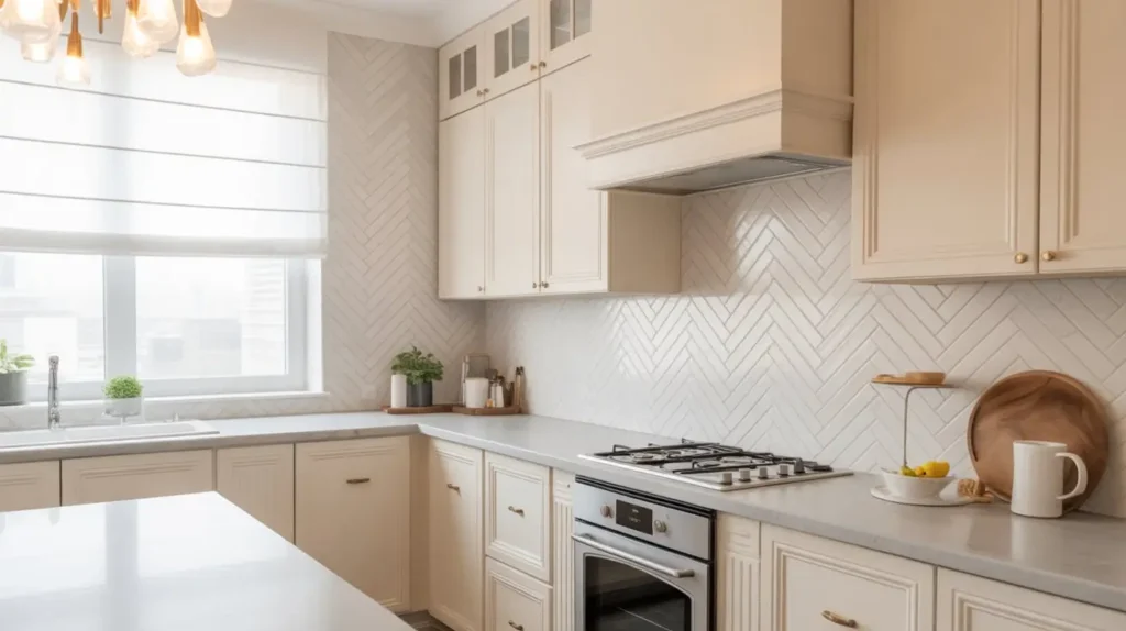
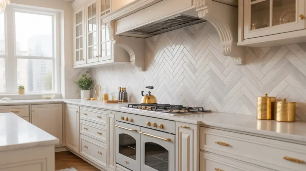
2. Herringbone White Marble Backsplash
Okay, you want white, but you also want to feel fancy. I get it. Nothing screams “I have my life together” quite like marble arranged in a herringbone pattern. This design takes the standard rectangular tile and angles it at 90 degrees to create a broken zigzag pattern.
The Visual Impact
The movement here is incredible. Because the eye follows the “arrows” of the pattern, it draws your gaze up and down, which actually makes your ceilings feel higher. Marble adds natural variation. Even if every tile is “white,” you get subtle hits of gray, violet, or gold veining. This prevents the “white box” effect where everything looks flat.
However, I have to warn you: your installer might hate you. Herringbone requires a lot of cuts, especially around outlets and corners. It takes longer to install, which means labor costs go up. But looking at the result? Totally worth the extra cash and the contractor’s grumbling.
Practicality Check
Marble is a natural stone. It’s porous. If you splash tomato sauce on it and leave it overnight, you will have a permanent souvenir. You must seal this backsplash annually. If you aren’t the type to wipe down surfaces immediately after cooking, maybe look for a porcelain tile that looks like marble instead.
3. Glossy White Ceramic Tile with Minimal Grout
Sometimes, you just want the light to bounce. A glossy white ceramic tile does this better than almost anything else. This is the “clean girl aesthetic” of kitchens. It’s dewy, it’s fresh, and it makes small spaces feel massive.
The Power of Reflection
I love using glossy finishes in kitchens that lack natural light. If you have a tiny window or just a few recessed lights, the backsplash acts like a mirror. It amplifies whatever light you do have. When you pair this with rectified edges (that means the tile edges are cut perfectly straight), you can get super thin grout lines.
Why do thin grout lines matter? Less scrubbing! IMO, scrubbing grout is the worst chore in existence. By minimizing the grout lines, you create a near-seamless wall of white gloss. It looks sleek, modern, and expensive, even if the tile itself was cheap.
A Note on Imperfections
Glossy tile shows smudges. If you have kids who like to touch walls with peanut butter hands, you will see every fingerprint. The good news is that ceramic is impervious. A quick swipe with a damp cloth and Windex clears it right up. It’s high maintenance visually, but low maintenance physically.
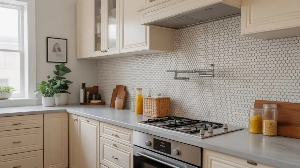
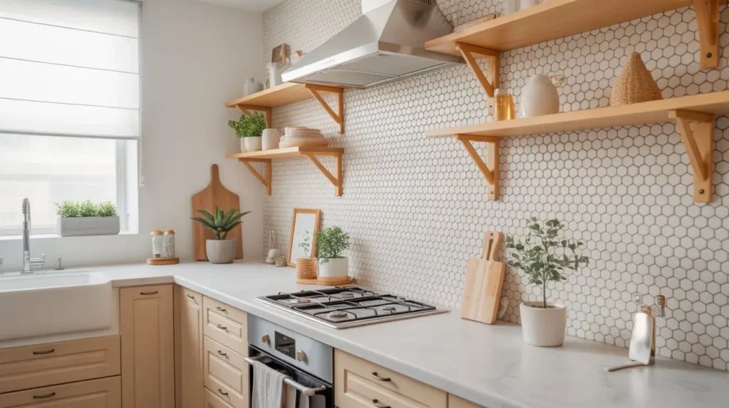
4. White Hexagon Mosaic Backsplash
Let’s break away from squares and rectangles. Hexagons (or “hex tiles”) bring a geometric playfulness to the room. They remind me of honeycombs, which feels appropriate for a kitchen, right?
Why Geometry Matters
Hexagons break up the linear lines of your kitchen. Think about it: your cabinets are squares, your fridge is a rectangle, your island is a rectangle. A hex mosaic disrupts all those straight lines and adds a layer of visual interest without introducing a crazy color. Small hex tiles (like 1-inch or 2-inch) create a lot of texture because of the grout lines.
Where to Use It
This style looks killer in transitional spaces—kitchens that aren’t quite modern but aren’t quite traditional either. I particularly love a hex backsplash when it fades into the wall paint at the top, rather than ending in a straight line. You can cut the tiles to create an organic, “falling” edge. It looks unfinished in an intentional, artistic way.
Grout Selection
Because you have so much grout with mosaics, the color you pick matters immensely. A dark gray grout will make the honeycomb pattern pop aggressively. White grout will make the texture subtle. Choose wisely based on how loud you want the wall to “speak.”
5. Farmhouse White Beadboard Backsplash
Are you chasing that cozy, cottage-core vibe? Beadboard is your best friend. This isn’t tile; it’s wood (or PVC) paneling with vertical grooves. It instantly adds warmth and charm that cold ceramic just can’t match.
Budget-Friendly Winner
If you are doing a renovation on a shoestring budget, beadboard wins. You can buy sheets of it at the hardware store, cut it to size, and glue it up yourself in an afternoon. Paint it a creamy white, and you have instant English countryside vibes. It pairs beautifully with butcher block countertops and open shelving.
The Water Warning
Here is the catch: wood and water are enemies. I would think twice before putting beadboard directly behind a sink where you do a lot of splashing. Over time, water can seep into the grooves or the bottom edge and cause swelling or rot.
The solution? Use PVC beadboard or “marine grade” paint. Or, simply use a standard tile backsplash right behind the sink and stove, and use beadboard for the rest of the kitchen perimeter. It gives you the look without the mold risk :/
6. White Textured 3D Tile Backsplash
Okay, this is for the modernists who want drama. 3D tiles actually pop out from the wall. They have waves, pyramids, or ridges sculpted right into the ceramic.
Shadows and Depth
The beauty of 3D tile is how it interacts with under-cabinet lighting. When you turn on those lights, the ridges cast shadows, creating a dynamic, shifting pattern on your wall. It turns a flat white surface into a piece of sculpture. It looks incredibly high-end and architectural.
The “Spaghetti Incident” Factor
I have to play devil’s advocate here. Think about cleaning. If you fry a lot of bacon or simmer sauce that splatters, 3D tiles offer a lot of little ledges for grease to land on. Wiping down a flat surface is easy. Wiping down a wall that has waves? That takes elbow grease.
I recommend this specifically for “dry” areas of the kitchen—maybe a coffee station or a bar area—rather than directly behind a professional-grade range. If you do put it behind the stove, commit to wiping it down every single night while the grease is still warm.
7. White Glossy Glass Backsplash
Glass tile has a depth that ceramic lacks. Because the color is usually on the back of the clear glass, you look through the material to see the white. It gives the wall a luminous, watery quality.
Modern Sleekness
This is a go-to for ultra-modern kitchens with flat-panel cabinets. It feels technological and precise. You can get glass tiles in subway shapes, but I prefer the longer, thinner “matchstick” or linear mosaics. They stretch the room horizontally.
One major perk: Glass is non-porous. It will never stain. Ever. You could throw red wine at it, and it would just drip off. For messy cooks, this is a huge selling point.
Installation Note
Glass is tricky to cut. It shatters easily if you don’t use the right blade. Also, because the glass is transparent/translucent, you can see the adhesive behind it. Your installer needs to smooth out the thin-set perfectly, or you will see ridge lines behind your beautiful tiles. I’ve seen this happen, and once you notice the trowel marks behind the glass, you cannot un-see them.
8. White Brick Pattern Backsplash
Do you love that exposed loft look? White-washed or painted brick brings a gritty, industrial texture that feels historic and grounded. It’s not perfectly smooth, and that’s the point.
Texture Over Perfection
Real brick veneer (thin slices of brick) painted white adds massive character. It contrasts beautifully with sleek quartz countertops. The roughness of the brick makes the smoothness of the counter look even smoother. It creates a tactile experience; you just want to run your hand over it.
The Maintenance Reality
I’m going to be honest with you: brick is a sponge. It is rough and porous. Dust loves to settle in the nooks and crannies. Grease loves to soak into the paint. If you go this route, you need to use a high-quality, scrubbable semi-gloss or satin paint. Do not use matte paint on a brick backsplash, or you will regret it the first time you make a curry.
Use a vacuum with a brush attachment to clean the dust off the bricks occasionally. It sounds weird to vacuum your walls, but it works.
9. White Chevron Pattern Backsplash
People often confuse Chevron with Herringbone, but they are different beasts. In a herringbone pattern, the tiles are rectangular. In a chevron pattern, the tiles are cut at an angle (usually 45 degrees) so they meet in a perfect point, creating a continuous zigzag line.
Sharp and Energetic
Chevron is sharper, punchier, and more aggressive than herringbone. It looks like a series of arrows pointing up (or to the side). This pattern creates a lot of energy. It feels fast and directional. If you want your kitchen to feel dynamic, this is the pick.
Styling Tip: Because the pattern is so strong, keep the rest of the kitchen relatively simple. If you have crazy veined marble counters and a chevron backsplash, your eyes won’t know where to look. Let the chevron be the star of the show.
Cost-wise, chevron tile is often more expensive to buy because of the specialized manufacturing cuts, but it’s actually slightly easier to install than herringbone because the tiles often come mounted on mesh sheets.
10. White Penny Tile Backsplash
Penny tiles are those adorable little round tiles, usually about the size of… well, a penny. They feel vintage, reminiscent of 1920s bathrooms and bistros, but they look super fresh in a kitchen.
Texture and Charm
From a distance, a white penny tile wall looks like a textured solid surface. Up close, you see the hundreds of little circles. It’s tactile and fun. It softens the room because there are no sharp corners in the tile pattern itself.
The Grout Nightmare?
Here is the rhetorical question of the day: Do you enjoy cleaning grout? Because with penny tiles, you have a high grout-to-tile ratio. There is a lot of grout.
My advice: Use a high-performance epoxy grout. It resists stains and won’t turn yellow or gray over time. Also, consider a light gray grout rather than bright white. It highlights the circles and hides the dirt. If you use white grout with white penny tiles, the pattern disappears, and it just looks like a bumpy wall. Contrast is key here.
11. White Matte Finish Large Format Tile

We’ve talked a lot about gloss, but let’s talk about matte. And let’s talk big. Large format tiles (think 12×24 inches or larger) minimize visual clutter.
The Soft Look
A matte finish absorbs light rather than reflecting it. It feels velvety and soft. It doesn’t demand attention. When you use large tiles, you have very few grout lines breaking up the space. This creates a calm, monolithic look. It is perfect for minimalist or Scandinavian-inspired kitchens.
Why I Love It
I love this look because it feels serene. It’s the visual equivalent of a deep breath. Also, less grout means less scrubbing (sensing a theme here?).
However, be careful with “faux stone” prints on large matte tiles. Sometimes the printed pattern can look pixelated or repetitive on large slabs. I prefer a solid white or a very subtle concrete-look white for this application. It keeps things looking authentic.
12. White Geometric Pattern Backsplash
We aren’t talking about simple hexagons here. I’m talking about arabesque lanterns, fish scales (scallops), or diamonds. These shapes bring personality and a touch of exotic flair to the kitchen.
Curvy and Fun
Standard kitchens are full of right angles. Introducing a curvy shape, like the Moroccan lantern style or a scallop, softens the entire room. It feels romantic. A white scallop tile, specifically, gives a subtle mermaid or nautical vibe without being cheesy.
Keep it Tone-on-Tone
Because the shape itself is “loud,” keep the color quiet. White geometric tiles with matching white grout create a texture that you only see when the light hits it right. It’s sophisticated. If you use a contrasting grout with a complex shape, it can start to look like a dizzying optical illusion.
FYI: These unique shapes can be pricier per square foot, but since a backsplash is a relatively small area, it’s a great place to splurge on something unique.
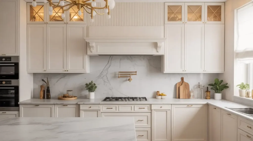
13. White Marble Slab Backsplash
This is the holy grail. The dream. Instead of tiles, you take the same slab material from your countertops (quartz or natural marble) and run it vertically up the wall.
The Ultimate Luxury
There are no grout lines. None. It is one continuous, sweeping surface of stone. It looks incredibly seamless and expensive. If you use a marble with dramatic veining, the wall becomes a piece of art. It makes the kitchen feel custom-built and substantial.
The Cost Factor
I won’t lie to you; this is the most expensive option on the list. You have to pay for the extra slab material and the fabrication. But, think about the labor you save on tiling and grouting.
Styling Tip: If you can’t afford to do the whole kitchen in slab, consider doing just the range hood area. Create a focal point behind the stove with the slab, and use simple subway tile for the rest. It’s a compromise that looks intentional and stunning.
14. White Subway Tile with Contrasting Grout
We are circling back to subway tile, but with a twist. The “Bistro Look.” Taking a standard white tile and pairing it with black, charcoal, or dark gray grout completely transforms the vibe.
Definition and Pop
This outlines every single brick. It makes the pattern the hero. It feels industrial, vintage, and a little bit edgy. It pairs exceptionally well with black hardware or matte black faucets.
The Practical Upside
Dark grout hides everything. Grease splatter? Can’t see it. Tomato sauce stain? Invisible. For a hardworking kitchen, this is a practical choice that also happens to be very trendy right now.
Caution: Your tile installation must be perfect. When you use high-contrast grout, it highlights every crooked line or uneven spacer. If your spacing is off by a millimeter, the dark grout acts like a highlighter pen pointing at the mistake. Hire a pro for this one.
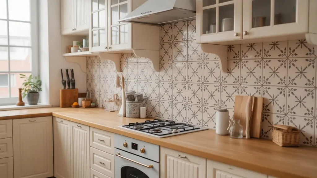
15. White Patterned Hand-Painted Tile Backsplash
Finally, let’s talk about texture through pattern. There are gorgeous ceramic tiles that feature white-on-white patterns painted or glazed onto the surface. Think delicate floral motifs or old-world damask patterns that are just slightly raised or glossy against a matte background.
Subtle Artistry
This is for the person who wants detail but is afraid of color. You get the artisan feel of hand-painted Spanish or Mexican tile, but the monochrome palette keeps it modern and restrained.
Personal Connection
I saw this in a friend’s kitchen recently. From the doorway, it looked like a white wall. As I walked in and the sunlight hit it, these beautiful intricate floral vines appeared in the glaze. It was a “wow” moment. It rewards people for coming closer.
This style adds soul to a new build. If your house feels a bit too “cookie-cutter,” adding a hand-painted textural tile brings in that sense of craftsmanship and history instantly.
The Final Verdict
So, which one is calling your name?
Are you a Subway Tile Purist who values safety and classic lines? Or are you a Marble Slab High-Roller ready to blow the budget for seamless luxury? Maybe you’re brave enough to tackle the dusting required for the 3D Texture.
Here is the bottom line: White doesn’t have to mean “blank.” It is a canvas. Whether you choose the reflective glam of glass or the rustic warmth of brick, you are setting the tone for the heart of your home.
My parting advice? Buy samples. Bring them home. Tape them to the wall and look at them in the morning light, the afternoon sun, and under your kitchen lamps at night. Whites change color constantly. Find the one that makes you smile when you walk in for that morning coffee.
Now, go transform that space. You’ve got this! 🙂